Lumière Autochrome 1907
How hard would it be to re-create Autochrome? Short of breaking out a 9 by 12 cm wooden bellows camera, mixing your own emulsion, spreading it evenly on a glass plate, then dying grains of potato starch red-orange, green and blue-violet and mushing them onto the prepared plate and exposing, developing, and fixing the whole lot – could one do it digitally?1 I guess the answer depends on how satisfied you want to be with the faithfulness of the result and how deep you’re willing to go.
In 1907 after inventing this thing called Cinema, the Lumière brothers invented and manufactured a single emulsion colour photography process using what was an analogue version of bayer filtering, with an random pattern mosaic of red-orange, green and blue-violet dyed potato starch grains smeared on a glass plate of a monochrome panchromatic film emulsion. The emulsion was processed (and reverse processed on the plate to a positive) but left the coloured potato starch grains untouched. Once processed, the film could be viewed as a transparency, and by backlighting, it illuminated the RGB grains with the density of the recorded image. It was called Autochrome, and it was a sensation.
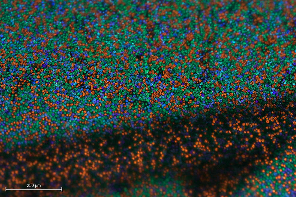 Credit: Gert Koshofer Collection. Sample No. 68. Photomicrograph by Sreya Chatterjee, HTW Berlin. From filmcolors.org
Nowadays this same idea of mosaic three colour filtering over a monocromatic image recorder is used for making single CCD and CMOS sensors see colour. Bayer filtering is credited to Bryce Edward Bayer, and was invented in 1974 at Kodak for a colour sensor they were developing. Essentially Bayer filtering is a colour mosaic filter with a square grid of red green and blue colour filters laid over the sensor in a pattern, like R-G-R-G-R-G / G-B-G-B-G-B. The sensor only sees light intensity (i.e., monochrome, but because it has been colour filtered by a known pattern, that image recording can be processed back with the colours added in, thus adding in the colour information along with the recording of the intensity of light.
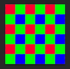 Bayer pattern
Bayer filtering is used in almost all modern electronic sensor cameras on Earth, and also on Mars.
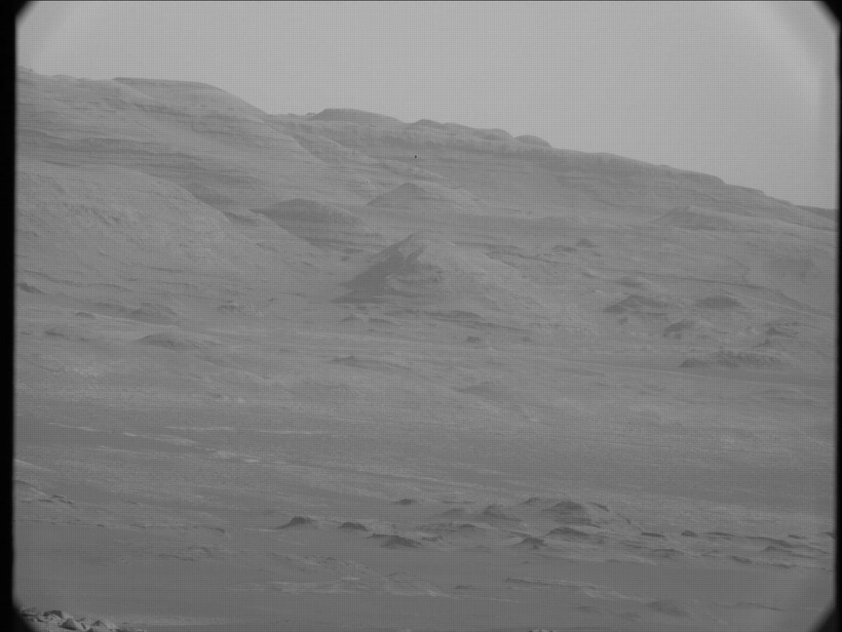 RAW Curiosity MASTCAM image. Image: NASA / JPL-Caltech / MSSS. Notice the grid pattern from the Bayer filtering.
 DeBayered Curiosity MASTCAM image. Image: NASA / JPL-Caltech / MSSS
Autochrome did colour mosaic filtering and de-filtering in 1907, in analogue, with potatoes, dye and panchromatic emulsion! It was pretty genius, and should be credited for laying the foundation or at least the inspiration for CCD and CMOS imaging.
If it’s that close, then how hard can making a digital model be?
The Basic Digital Method
Let’s break down how Autochrome works and see if there are digital methods available to replicate the process.2
- Colour filtering – yes. Like the method used for my other digital models, add a colour layer and multiply (let’s ignore the potato grain mosaic for the moment).
- Panchromatic emulsion - yes. I’ve been using a modified Black & White effect in After Effects set to 100 on all levels to simulate the monochromatic all colour capture of panchromatic. We’ll use a separate panchromatic emulsion for each colour filter and recombine later (still ignoring the mosaic).
- Additive de-mosaic colour filtering of the recorded image – yes. Colour each separation with it’s filter colour and use an Add blending mode (in 32-bit float - otherwise use a Screen blending mode) to recombine.
- The potato grain mosaic – hmmm… let’s get back to that one.
- Lamp black fill in between the potato starch gains. The Lumière brothers used this to fill the gaps, so that only the colours were recorded, and only the colours passed through when the processed plates were viewed – hmmm… probably not needed since we’re not backlighting images and having light leak through.
Sounds like a challenge!
Colour filtering
It looks like building the colour filtering is fairly straight forward, if I use my previous methods. Yes, it is a bit of a cheat. I guess if one was so inclined, one could build a random pattern of digital potato starch grains, one for each colour, layer them together in a blending mode and use that for making the panchromatic density map, then recolouring with the same grain pattern.
In theory that would work, but in digital we’re dealing with pixels. And pixels are pretty big compared to the Autochrome potato starch grains. Look at the Koshofer Sample No. 68 photomicrograph, the scale indicated is 250 nanometers! According to Brian Coe in Colour Photography. The First Hundred Years 1840-1940 there were about 4 million starch grains per square inch.3 If you wanted to represent a dyed potato starch grain with a pixel you would have to set up your image at 4,000,000 dpi! Good luck doing anything like adding a noise effect to build random grains at that resolution. I hope you like long render times. Or you have a computer that runs at:
The Autochrome grains themselves are too small to be resolved by human eye without optical assistance and were in effect invisible, except when they clumped together. Unlike a Bayer pattern, the process of building an Autochrome grain colour filter was random, analogue, and imprecise. Clumps of single colour occured. These imperfections are also what made Autochrome wonderfully physical, like brush strokes on a oil canvas.
For now, let’s start with digital colour separations, density maps and recolouring using the method I used on Technicolor modeled after the work done by Rob Legato’s VFX team on The Aviator.
The first thing we need, is a good sample of the dyes used on the potato starch grains. There are a number of micro photographs available, and none agree exactly. But perhaps we should look at some autochromes to get an idea of what we’re aiming for.
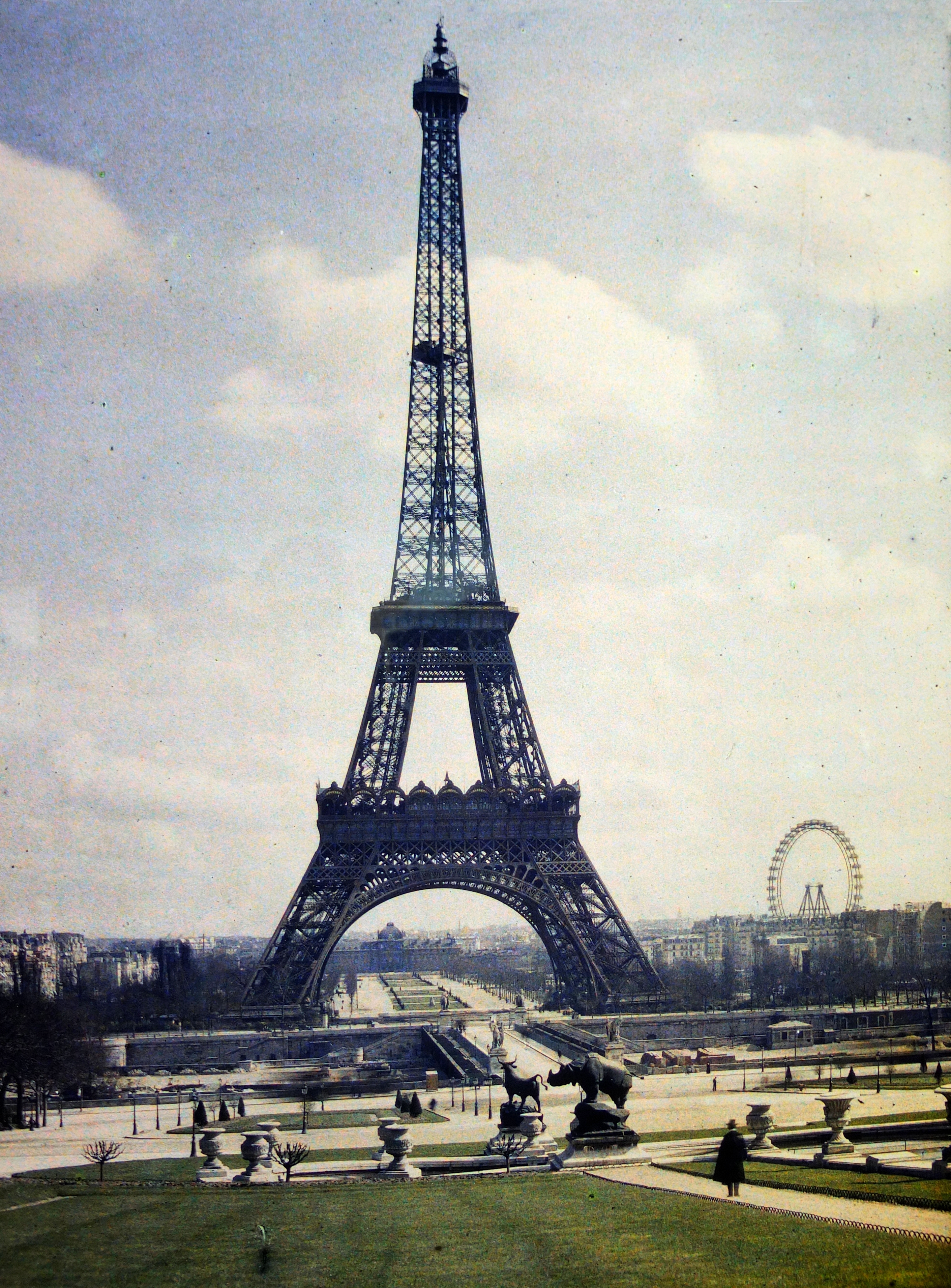
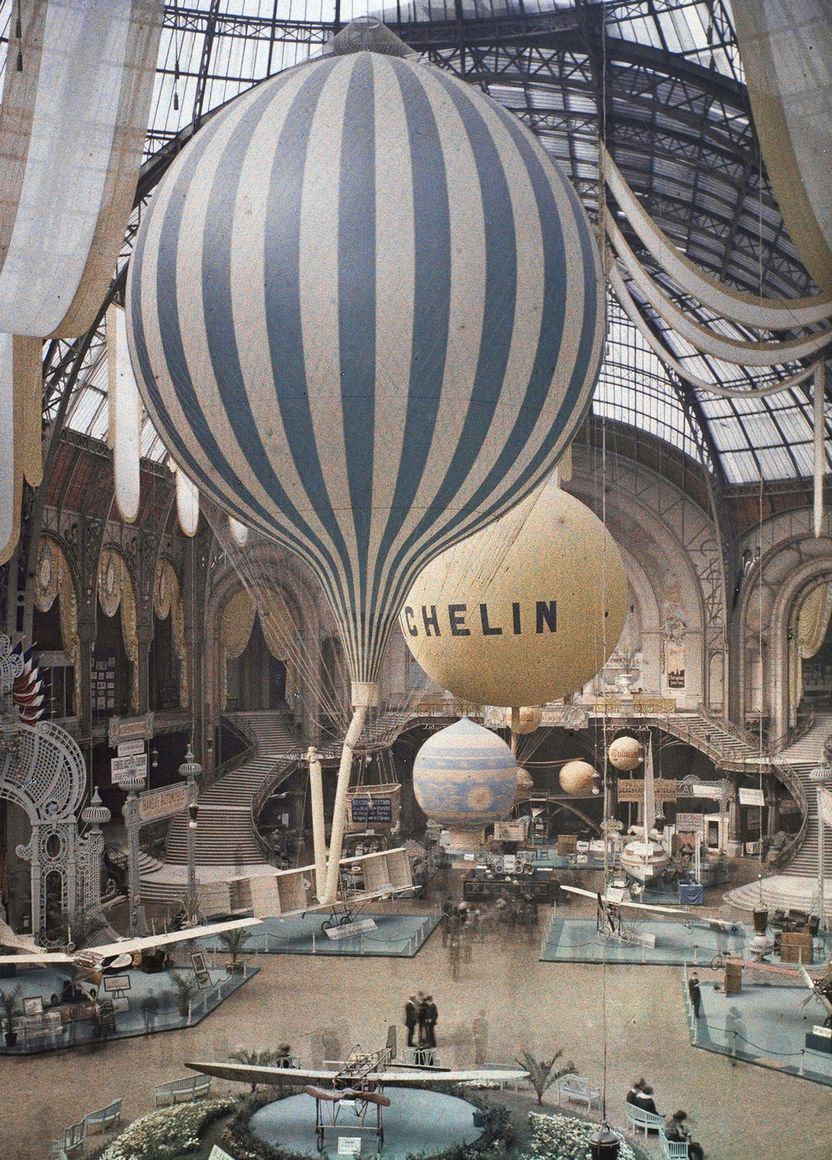 Exhibition aeronautique dans le Grand Palais à Paris. Photo par Léon Gimpel, 1909, from Wikipedia commons.
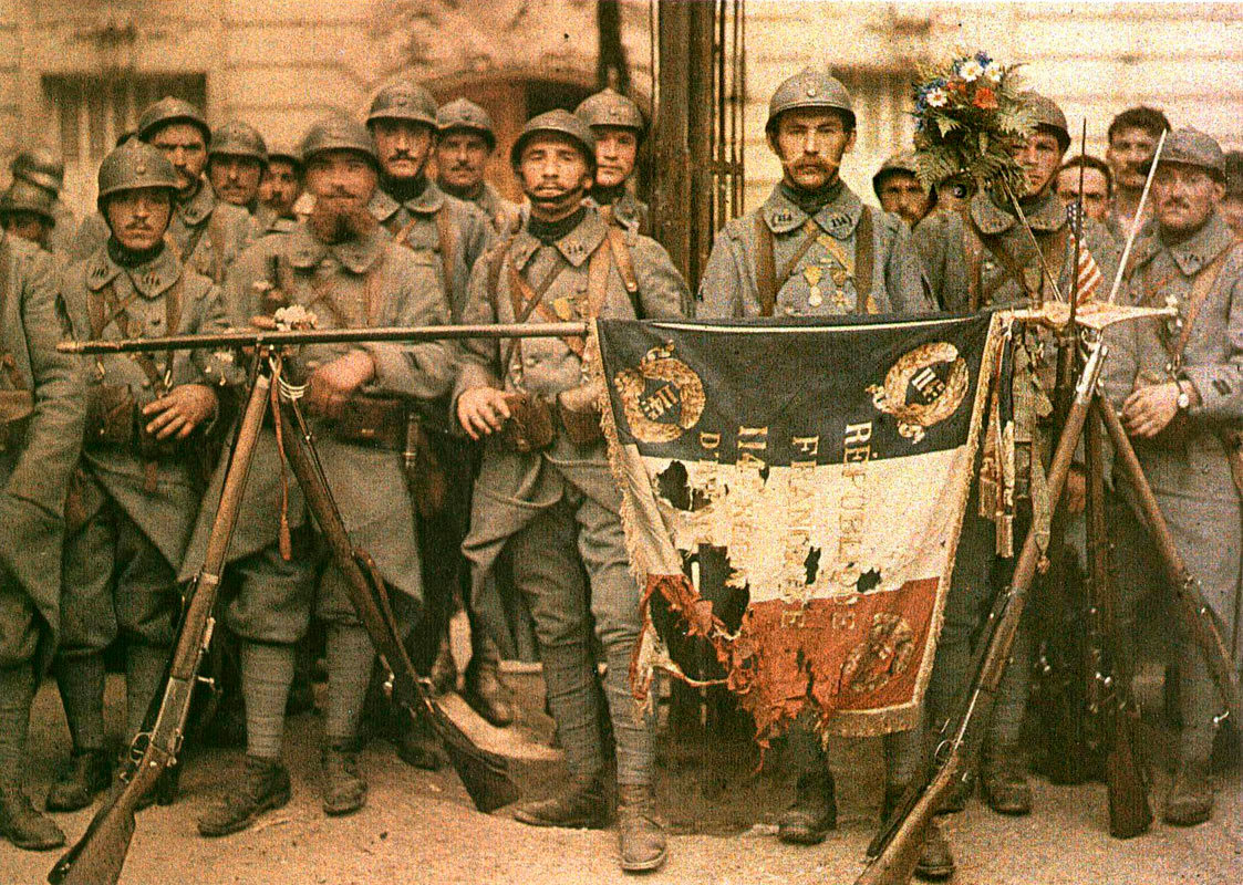 114th Infantry in Paris on 14th July 1917. Photo par Léon Gimpel, 1917, from Wikipedia.
 By Auguste Léon - Own work, Public Domain, from Wikipedia.
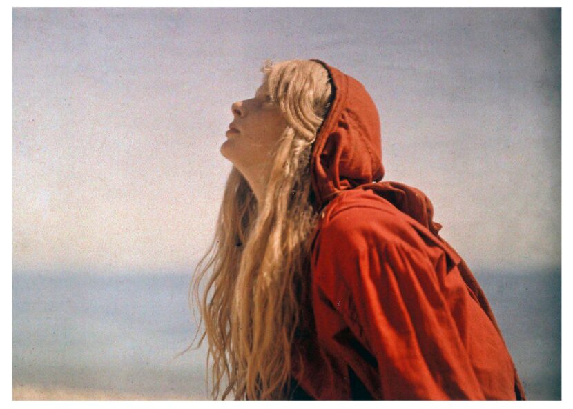 Christina in a Red Cloak, 1913, Mervyn O’Gorman © Royal Photographic Society Collection, from National Science and Media Museum.
Here’s what I see:
- Somewhat muted blue, with maybe a cyanish shift. Take a look at the blues in the Exhibition aronautique.
- Orange shifted reds, evident in Christina in a Red Cloak. This also might be a result of yellow filtering in front of the lens, which was recommended by Lumière.
- Great dynamic range, which you would expect from photochemical. Black blacks, and white whites. Take a look at the shadows on in the Grand Palais à Paris, and the white wall hangings on the left.
- Long exposure times. Look for the shadow figures on the floor of the Grand Palais à Paris, the blur of a streetcar in front of the Eiffel Tower and the glassy, blended sea behind Christina in a Red Cloak.
- The clumps of potato starch grains, looking a lot like colour noise or pointilism. Evident in every photo, especially in solid colours with gradients up in the highlight areas.
For creating the colour filtering, it would be helpful to be more precise than saying “a cyanish shift” or “an orange shift”. We can do this with a colour reference. If we had something we knew the colour of that we could measure, we could see the original colour and Autochrome’s colour shift.
It turns out, we do have a colour reference, the tricolor flag of the Republic of France. Unfortunately there are a number of ways this is not going to be precise enough.
- We don’t know the colour temperature of the light that the 114th Infantry was photographed in on 14th July 1917. But we can assume it was daylight and we can assume that the autochrome panchromatic film was somewhat balanced to Paris daylight, so the white in the flag should be white-ish.
- The yellow of the photograph, we can attribute to yellow filtering, 4 or aging, or being fried from exposure to a bright incandescent light source in viewing at some point in the plate’s life. We can restore the whites digitally to get an idea of what the starch grains dye was doing, but this will add imprecision.
- There have been a number of versions of the French national emblem. The original was darker, the newer 1976 one was lighter. We’ll use the darker version, and use the French Navy (HCC)’s specifications.5 The colours are ANFOR Blue A 503, White A 665, Red A 805. Even with that, there was never an official established rule for the colours. The French Navy’s specifications will have to do.
It won’t be precise enough to create a LUT (look up table), but it will give us a target and a sanity check for a digital process.
Here’s the image, with the white point adjusted for white, and samples of the flag colours. The French Navy tricolour samples are on the left, the autochrome tricolour samples are on the right.
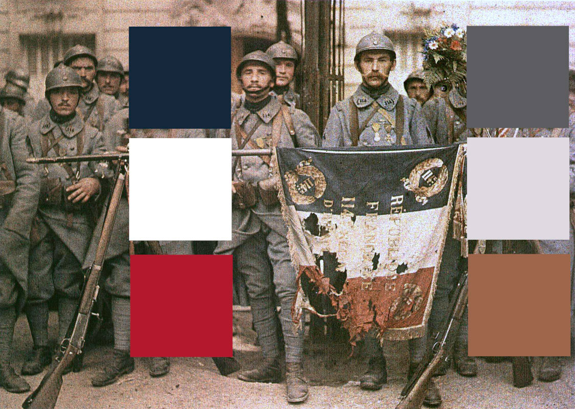 The 114th Infantry with tricolour samples.
Now we can see the shifts. Blue goes from hue 215, saturation 48%, brightness 24% to hue 240, saturation 3%, brightness 38%. Red goes from hue 352, saturation 80%, brightness 60% to hue 22, saturation 45%, brightness 56%. That is pretty dramatic, assuming that my assumptions and mangling of the image is inside the ballpark.
To check that I’m somewhat correct, let’s match saturation and brightness on the autochromed tricolour samples.
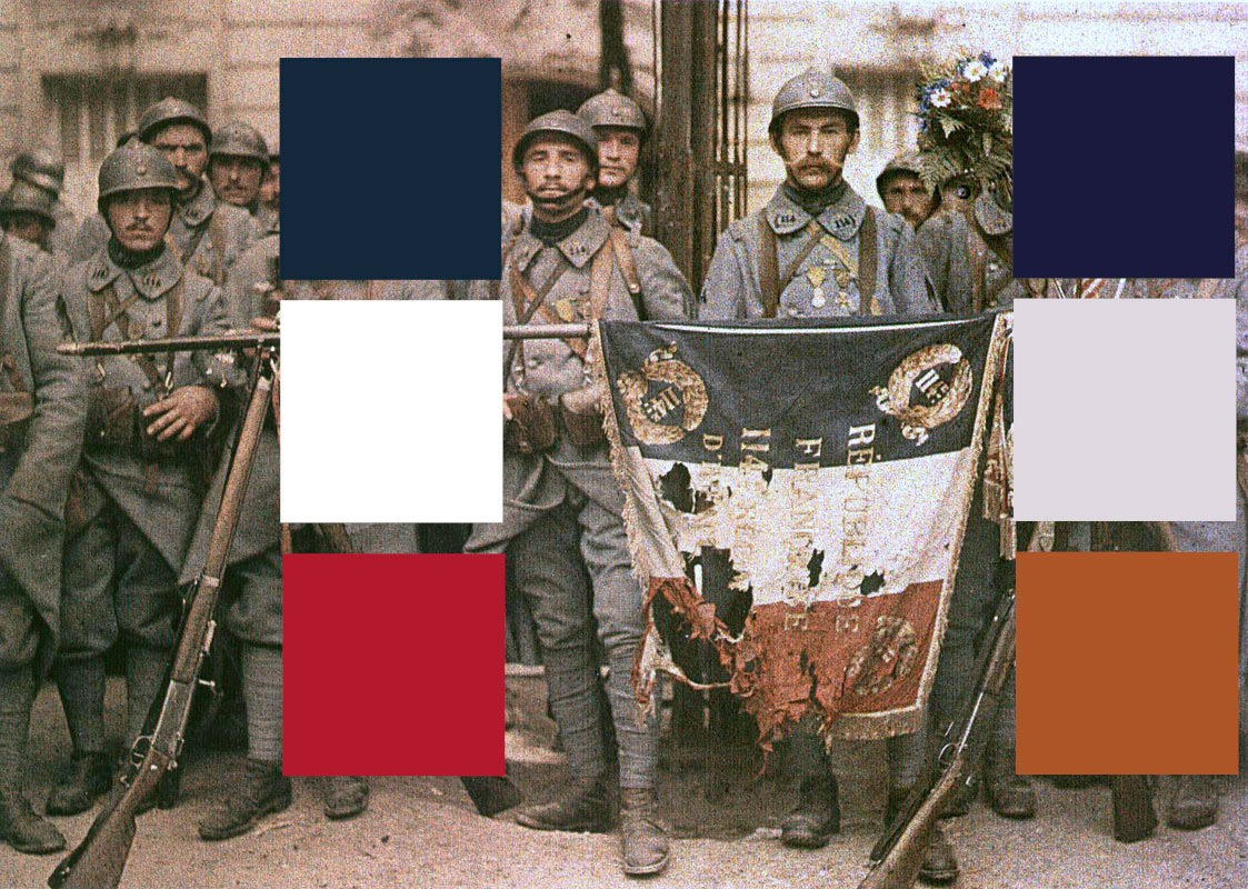 Saturation and Brightness matched Autochrome samples.
Now we have an idea of what an Autochrome process does: orange shifted reds and royal purple shifted blues, but also desaturated blues and somewhat desaturated reds. It confirms what my inner colourist was seeing from the sample photos.
Filter colours
Sampling the actual dyes from the potato starch grains should be easy. There are a number of microphotographs of Autochrome dyes out there. Some are closer to being orange-red and royal blue, some are totally off mark (like a few samples on filmcolors.org).
I’m going to go with the Ger Koshofer Collection Sample No. 68, just because I need to pick something and it looks like it will produce orange shifted reds and royal purple shifted blues.6
Credit: Gert Koshofer Collection. Sample No. 68. Photomicrograph by Sreya Chatterjee, HTW Berlin. From filmcolors.org
From it, I get samples of:
- red: hue 22
- green: hue 134
- blue: hue ???
Hue is all we need. For modelling the colour using the method I use, colour separations are created from the hue plus saturation at 100% and brightness at 100%. For using a multiplied colour solid for digital filtering, 100% brightness captures all the highlights and 100% saturation captures all the blacks.
Fnding a good sample of blue is problematic. If you look closely at the Koshofer grain image, there is a fair consistency of orange-red and green grains, but the blue grains vary from deep purple (hue 258) to dark blue (hue 223 to 237) to light blue (hue 212). Which is right? Maybe all of them. I would guess that the potato starch grains took the blue dye differently and inconsistenly or some potatoes may have a natural blue colour that was only enhanced by the blue dye (like a purple potato).
 Aditondack Blue potato, showing the natural variation in purple colouring. Photo by Nikchick - https://www.flickr.com/photos/nikchick/506047785/in/set-107282, 2007.
Regardless, the inconsistent blue is part of Autochrome. Can we account for it in a digital model?
In my colour modelling method, I can only use one colour for a separation. So I guess I’m going to have to pick one blue and see how it looks. From the data set of hues for blue: (212, 223, 237, 257, 258) I get a mean of 237, which is curiously close to an RGB “pure” blue of hue 240. So, let’s go with:
- red: hue 22
- green: hue 134
- blue: hue 237
Unlike my other colour models, these same colours will be used for the dyes to recombine the colour separations.
 Our proposed Autochrome colour model.
In a three-colour model, the Autochrome dyes create a bit of a greenish-black. How interesting, and wonderful. Let’s build an Autochrome digital model see what these dyes do.
The Model
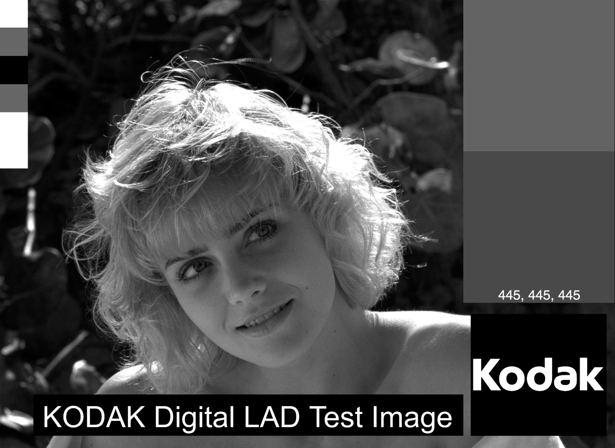
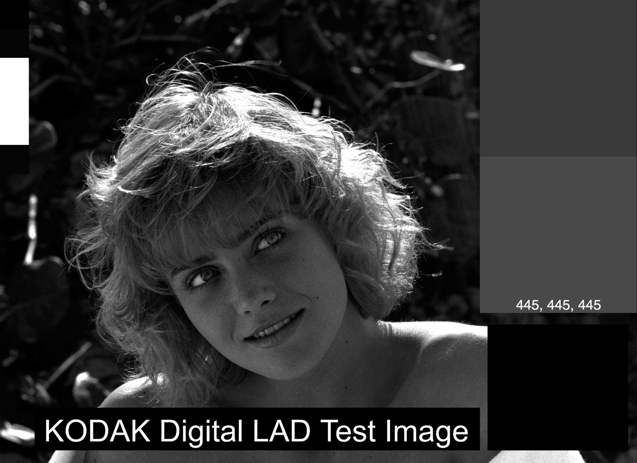
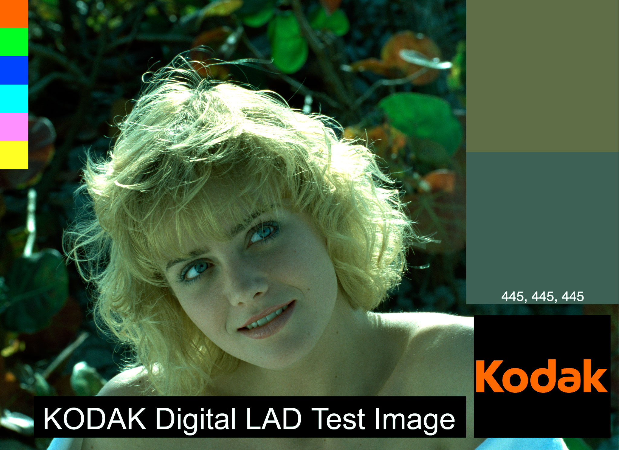
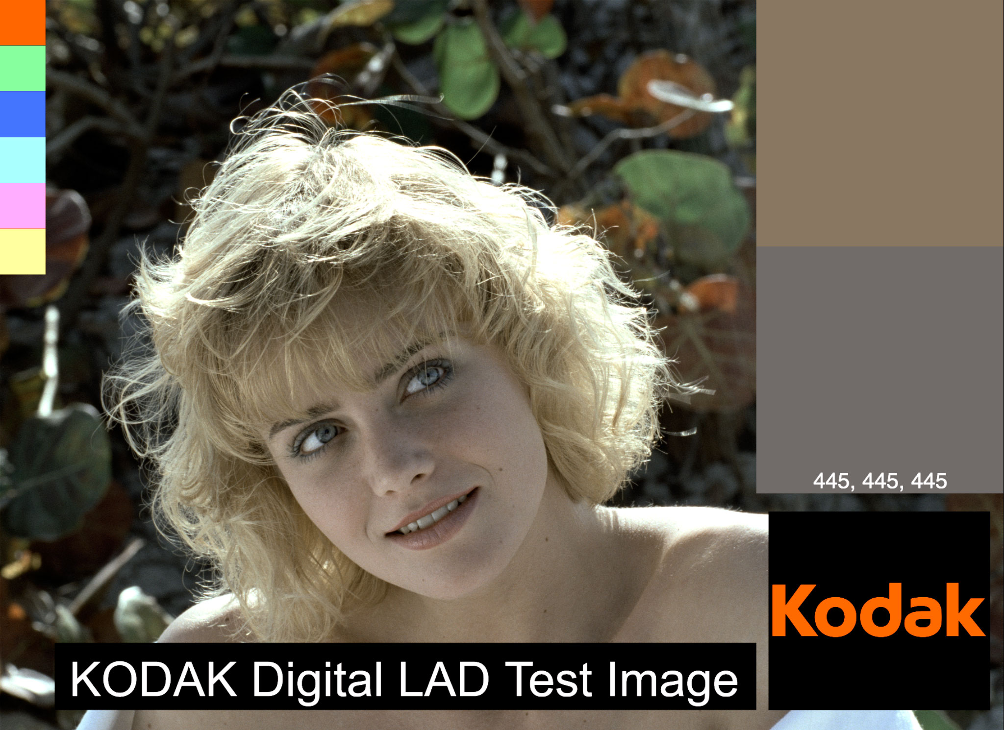
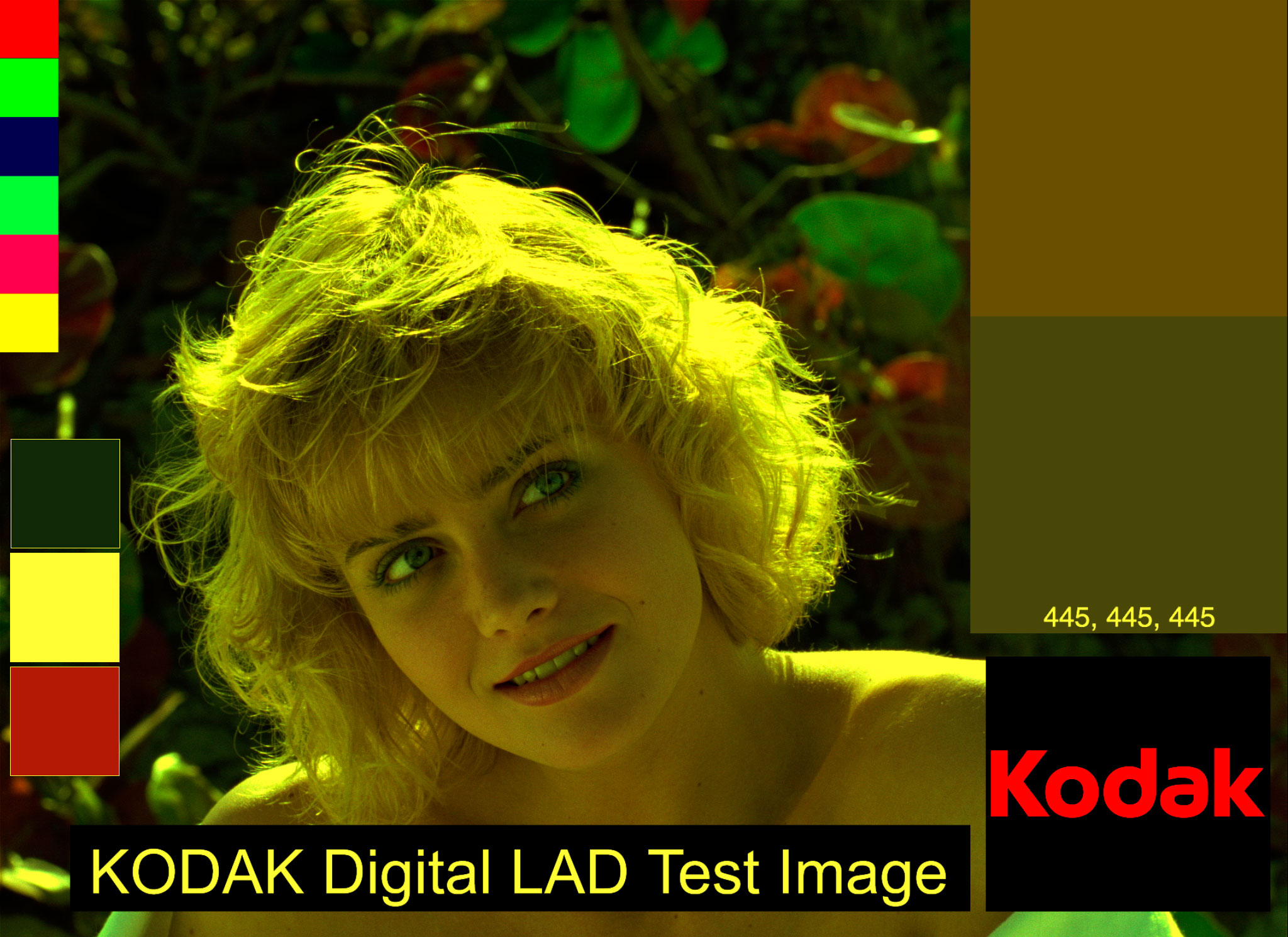
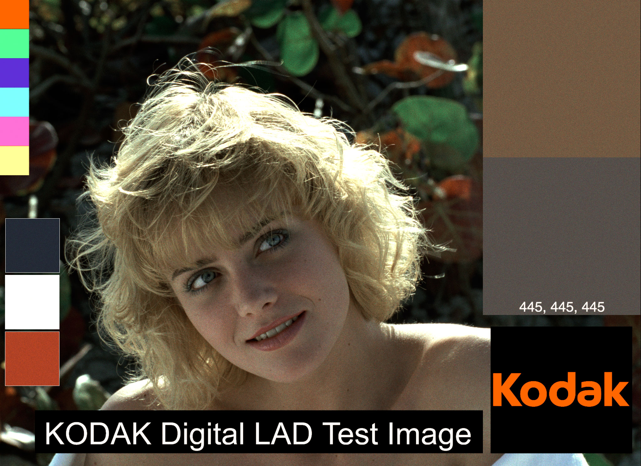
First, use each of colour filters to create separate density maps of the image. We’ll use the good old Kodak Digital LAD as our source image. The Digital LAD comes in DPX or Cineon format, but I have a TIFF conversion in Adobe RGB (1998) colour space if you want to play along.
Because Autochrome was more of a still image process, this time I’m going to do the modelling in Adobe Photoshop instead of Adobe After Effects. The modelling process should work in almost any image manipulation/compositing software that can do blending modes.
If you’re following at home, import your image. Set up Photoshop to work in 16-bit RGB, because this stuff matters, especially for deep colour work. I would like to use 32-bit, but certain features I need for this process aren’t available in 32-bit mode Photoshop.
Duplicate the source image and create a solid colour layer with the hue of the filter dye, with saturation and brightness set to 100. I like to use the paint bucket tool to create the solid colour. Place the layer over top of your image. Multiplying one image over another is digital equivalent of putting a filter in front of an image, so multiply the colour filter layer with the copy of the source image layer and merge to join the layers. Then, make a monochrome of the image. In After Effects, I use the Black & White effect, with all colour channel settings set to 100%. In Photoshop, use the Black and White image adjustment with all the colours set to 100%. In fact I’m going to use it so much, I’ll save it as a preset, named Panchromatic. Be sure to name your filtered, density map layer results so you know what they are later. I name mine, red separation, and so on.
Keep going with each filter colour, making a colour separation for each.
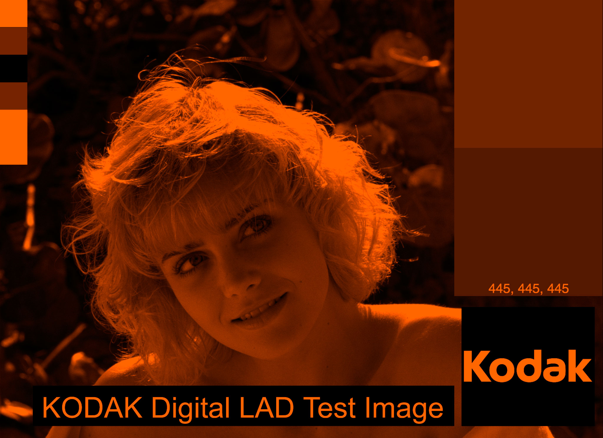
 Red separation
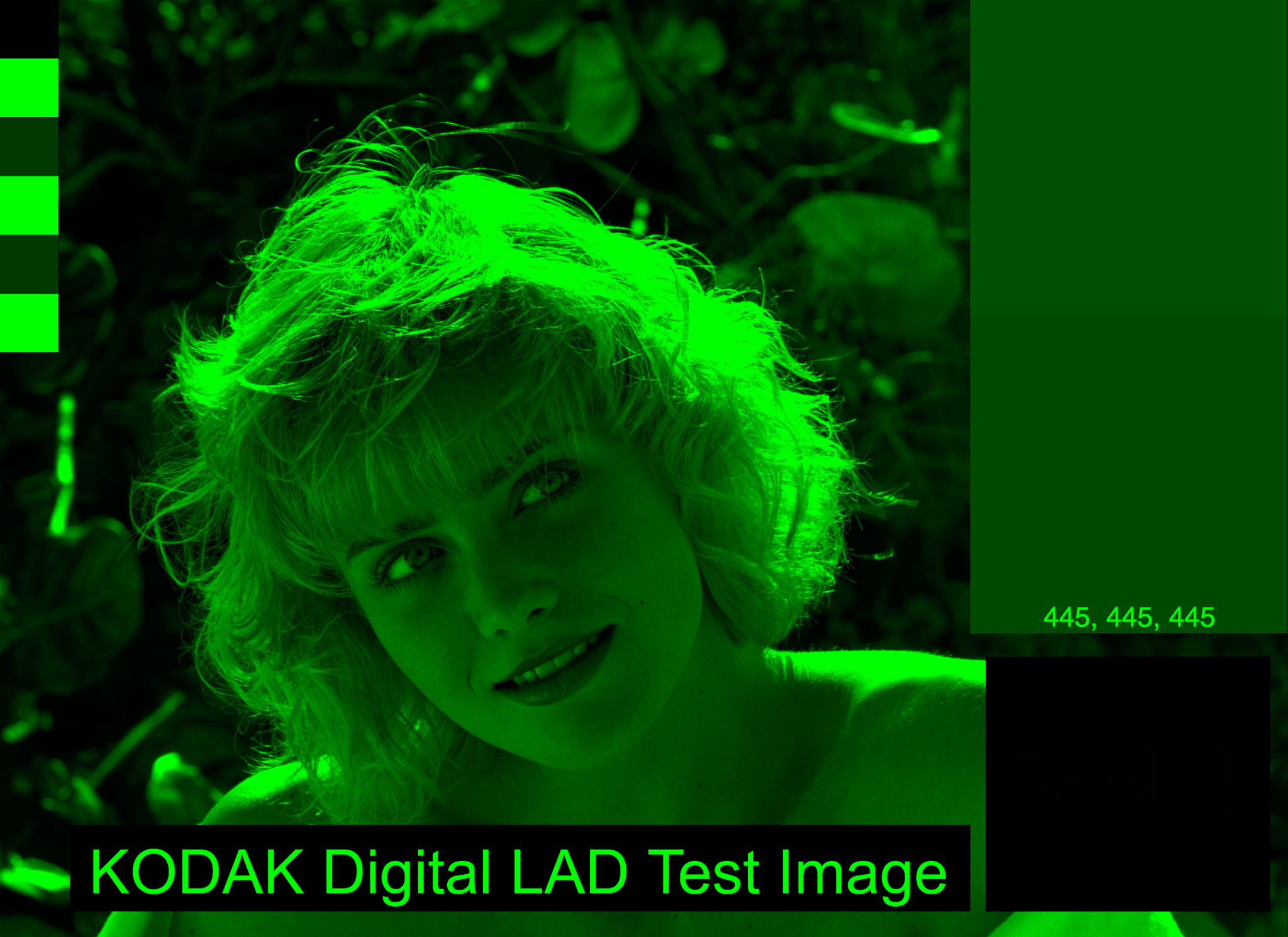
 Green separation
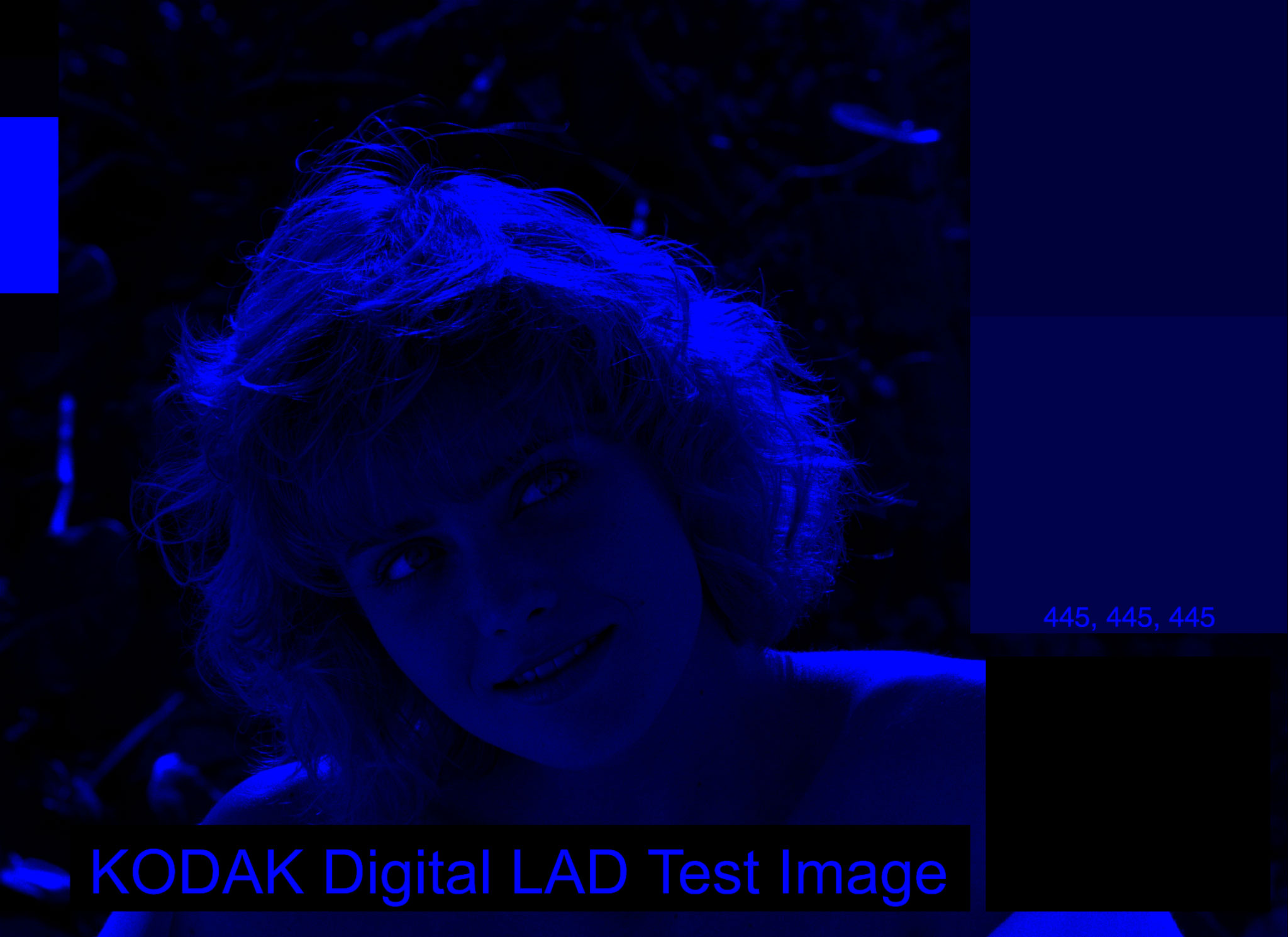
 Blue separation
Now we have a digital equivalent of filtering onto a panchromatic film stock. What we’ve done is selected out a band of colour and recorded it’s image density.
Now that we have the equivalent of a filtered density map, let’s add back in the colour. Instead of melding all the layers together, we’ll keep them separate and put them all back together, coloured.
Add in a new layer with a colour solid above each image separation corresponding to the layer’s colour, i.e., the red separation gets a red colour layer over it, (red colour is H: 22, S: 100, B: 100), just like the colour filter. Use a multiply blending mode to add the colour to the separation layer and merge them together.
Do this for each colour separation.
 Red coloured separation
 Green coloured separation
 Blue coloured separation
Put them all together with a screen blending mode (because Screen is the 16-bit equivalent of Add in 32-bit, and Add is the digital equivalent of multiple exposing images, which is the same as pointalist dots of light from an autochrome converging on your retina).
 Ta-da! Version 1 of digital Autochrome.
The result gets high marks for white-whites and black blacks, and for getting the colour shifts of red, green and blue sort of right. But the greys are biased green and slightly blue.
Let’s go back to the dye samples again. Take a look at the Koshofer image again.
Credit: Gert Koshofer Collection. Sample No. 68. Photomicrograph by Sreya Chatterjee, HTW Berlin. From filmcolors.org
We see fairly even red, green and royal blue grain in the lit part of the image, but in the shadow (or maybe trough) I see blue and green falling off into the darkness while red stands out. Interesting! Does this evidence mean that green and blue need to be, or can be, adjusted?
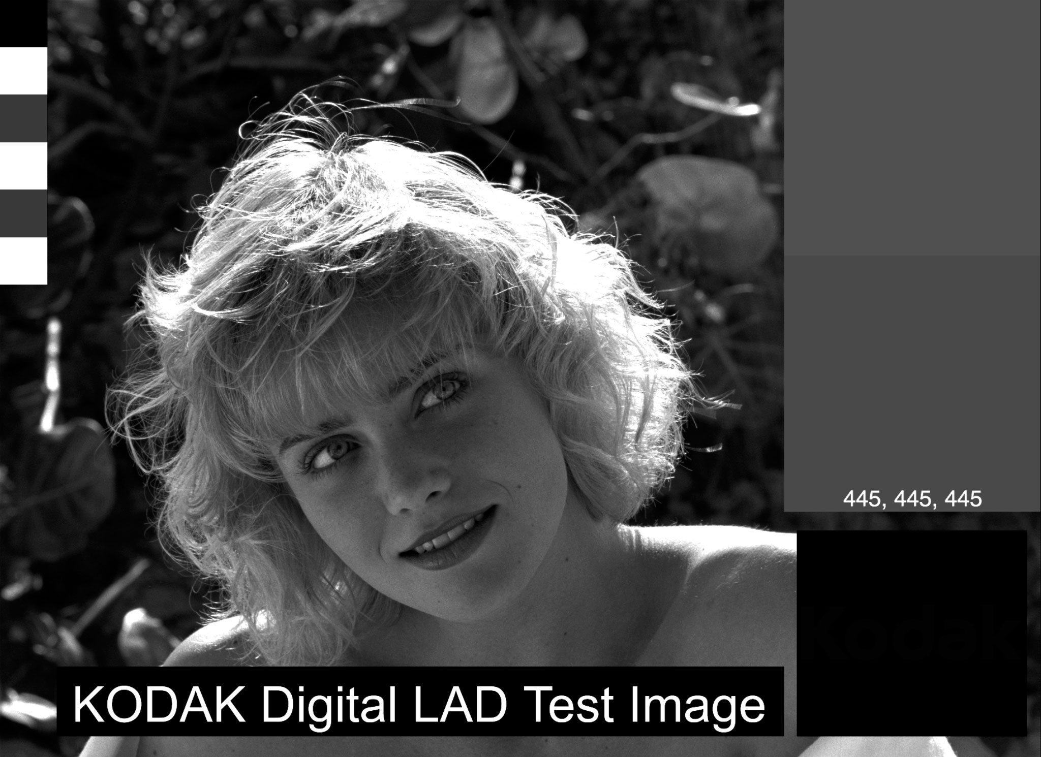
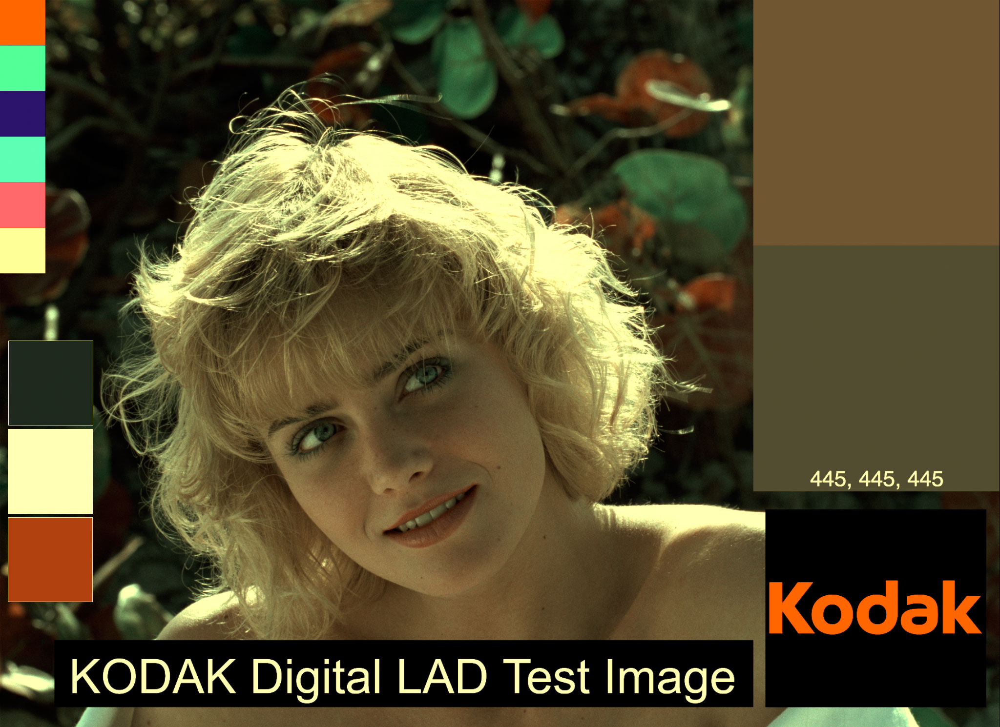
I’ll just give you the answer: yes, I think so. If green saturation is set to 50% on the re-colouring stage, and blue’s saturation to 75% the image evens right out. This also matches what my eye is seeing in the dark area: red 100%, blue dark and green very dark.
 Autochrome version 1.1, with the saturation of greens and blues adjusted.
Now that feels more like Lumière Autochrome. Take a look back at the Exhibition aeronautique photo. I think the blue patch feels more like the blue on the big balloon. We also now get some nicely balanced greys and some nice skin tones.
There’s just a couple of things still bothering me:
- Skin tones are too pale. Compare Marcie to Christina (in a Red Cloak). Chrsitina’s skin is rich and orange, while Marcie is pale and a bit bluish.
- Where is the violet? The haze in Paris on and behind the Eiffel tower is purple. There is a lot of violet in the potato starch grains in the Koshofer micrograph.
Let’s start with the blue. Maybe I was completely wrong, and blue should be more violet. So let’s shift it over to the highest sample of purple from the micrograph (Hue: 258) and see.
 Autochrome with purple instead of blue.
It looks horrible, but be patient with me. I’m going somewhere.
Red, White, Blue
Let’s do a test and run the French Navy tricolour samples through and see what we get. Our originals were Blue hue 215, saturation 48%, brightness 24%, and Red hue 352, saturation 80%, brightness 60%.
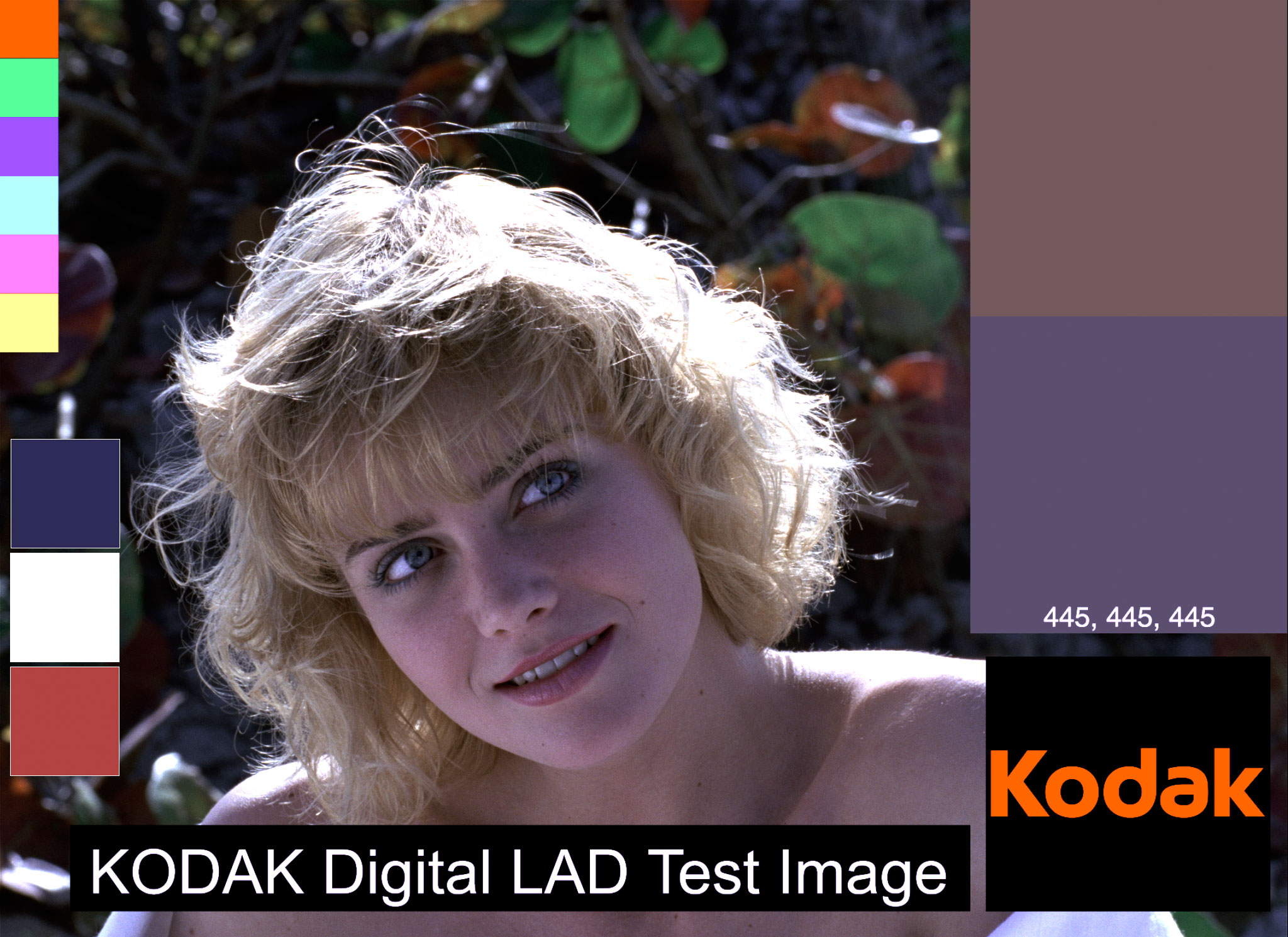 Digital LAD with tricolour samples, run through the Autochrome process.
Blue goes H: 243, S: 36, B: 44. Red goes H: 1, S: 57, B: 60. Compare this result to the León Gimpel 1917 image, with the Autochrome effected colours on the right, where red goes to hue 22, saturation 45%, brightness 56%. and blue goes to hue 240, saturation 3%, brightness 38%,
Saturation and Brightness matched Autochrome samples.
With the Autochrome blue dye set to hue 258, the blue tricolour patch goes more violet now, with hue at 243 like it should. Red is off now, not getting orange enough, coming out at hue: 1.
What I need is something added that would orange the red and the skin tones. Something like a… yellow filter maybe, like the one used by Autochrome photographers and the one we haven’t built into the model yet.
Filtering
What kind of yellow filter do we need? I good guess is one that takes out some purple (or to be more accurate, deepens the hue into blue). I could just make yellow in Photoshop from 100% red and 100% green, but a more historical example might be better. Since I can find no documentation for what might have been used for Autochrome (there is probably some French-language source in an archive somewhere that I don’t have access to), we can probably consult Wratten filters for a logical substitute.
According to Kodak, Wratten 8 is a yellow filter that passes less blue than Wratten No. 3, which they don’t list. All we need is slightly less blue so let’s use it.
Here’s an example of a Wratten 8 filter, image courtesy of an ebay seller. Thanks, internet.
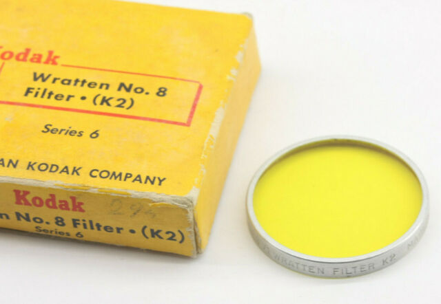 Kodak Wratten No. 8 filter.
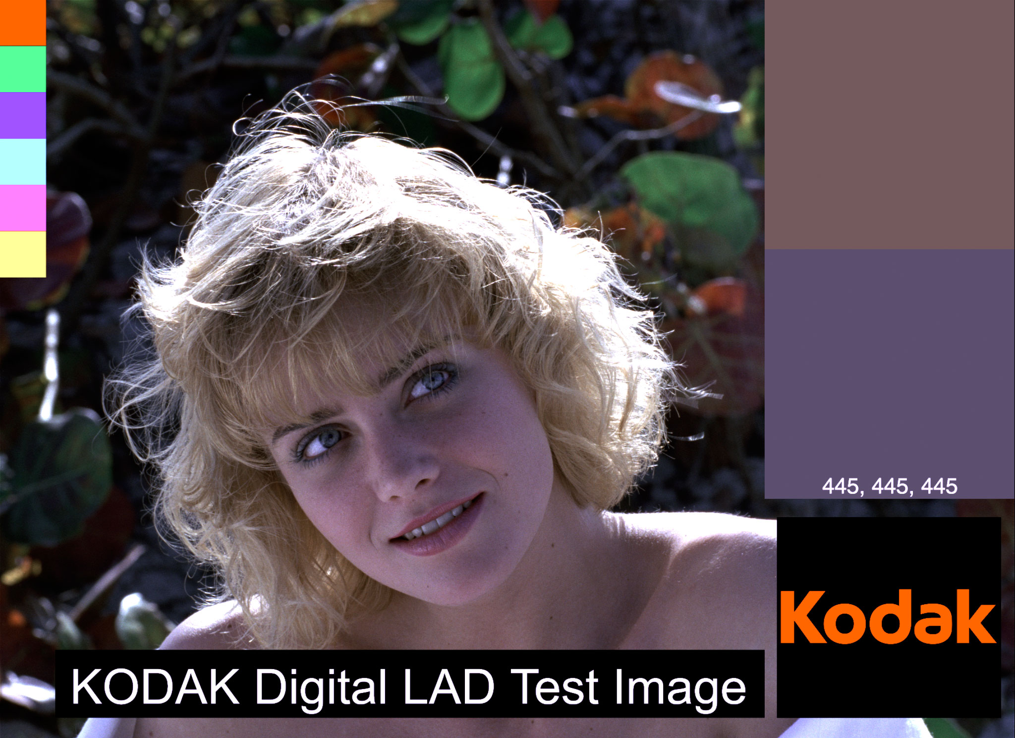
Sampling the yellow, I get Hue 59, Saturation 70, Brightness 100. Let’s plug that into the model on the initial level, multiplying it on to the source image and running everything again.
 Wratten 8 filtered source.
 Wratten 8 filtered result.
The result is interesting. On the grey patch, blue is way down, but almost one-third. The overall image is greyer. The whites have gone yellow, and the solid blue patch has gone more into royal blue. All of a sudden, we have something that looks like the 114th Infantry in Paris.
Uncorrected image of 114th Infantry in Paris on 14th July 1917. Photo par Léon Gimpel, 1917, from Wikipedia.
Wow, I think I might have just figured out Autochrome.
Of course, the point of the yellow filtering on camera was to balance out daylight blue biased light on the image. Not every Autochrome photo had this yellow tint. I think for the 114th Infantry’s photo, the photographer showed up on a July day (less blue light than fall or winter) expecting midday sun (bluer light at midday) and put the full yellow filter on the lens; but perhaps shot late in the day (more orange), or early in the morning (more orange).
Either way, I’m thinking there must have been a set of yellow filters available with different colour densities. It would make sense, since in 1928 there wasn’t the ability to fix an Autochrome in post. (Well, there was, with a neutral permanganate solution H and the fixing bath. See Note 4 below.) [4]
Perhaps we need just a little bit of yellow, say at about 10 to 50% saturation. Let’s try 40% and see.
 Marcie with a 40% saturated yellow filter and run through the process.
The skin tones look good, the whites look white, the reds shift orange, the blues go violet and the tricolours visually match the flag colours to the 114th’s battered flag.
Clumps
There is just one more thing we need, and that is to simulate the grain clumps.
 By Janke - Microphoto of Autochrome plate. Previously published: none, CC0, https://commons.wikimedia.org/w/index.php?curid=59895944. Squint your eyes and see the clumps.
The easy way to simulate potato starch grain clumps is to add some gaussian noise. Gaussian noice is a common method of simulating film grain. We need something just a little different. I use the overlay method, building a 50% grey solid layer in Photoshop, then adding an Add Noise filter set to 5% Guassian noise. Keep it set to non-monochromatic, because we want to build red, green and blue noise. Photoshop makes all kinds of colours in the noise filter, but the colour filtering in the Autochrome process will change it to orange-red, green and violet. Set the grey noise layer to an Overlay blending mode. Unlike adding film grain, I don’t blur the layer, because Autochrome clumps look sharp to me.
 Digital LAD, 40% yellow filtering, Autochrome process with noise added for starch grain clumping effect.
The Process
After that long ramble, here’s the final process for doing a digital Autochrome (using Adobe Photoshop).
- Yellow filter your image. Duplicate your source image. Add a colour solid layer above it. Use the Paint Bucket tool to fill the layer with a yellow colour, set to Hue: 59, Saturation: 40% (anywhere between 0% to 50%, as you wish), Brightness: 100%. Set the layer’s blending mode to Multiply. Merge the duplicated source image and the yellow colour solid together. You should have a yellow shifted version of your source image. Call this your source image for now on.
- Build colour separations. for red, green and violet. Duplicate your source image and add a colour solid layer above it, set to the following: for Red: 24 100 100, for Green: 134 100 100, and for Blue: 237 100 100. Use a Paint Bucket tool to create the fills. Set the colour solid blending mode to Multiply. Merge the color solid layer with the duplicated source layer. You’ll end up with 3 colour separations.
- For each colour separation, use the Black & White Image Adjustment to create a density map. Set all the colour levels to 100%. If you want, save the setting as a preset and call it Panchromatic. You’ll end up with three black and white density maps of each colour separation. Label them the colours (Red, Green or Violet).
- For each colour separation density map, recolour by adding a colour solid layer, set to the following: for Red: 24 100 100, for Green: 134 50 100, and for Blue: 258 75 100. Set the colour solids to a Multipy blending mode. Merge each colour with the density map. You’ll end up with three coloured density maps. Rename them if you need to.
- Combine each coloured density map with a screen blending mode and hide all other layers. You should now have a full colour autochrome version of your image.
- Add clumps with a colour noise layer on 50% grey solid and use an overlay blending mode.
And there you have it, a digital Autochrome process, one that is sort of faithful to the original. At the very least it a process that is somewhat practical to use.
LUT
If you want to skip all the labour, I’ll make LUTs and post them to the projects page of this site.
Published January 8, 2024.
Notes
- If you really want, the complete instructions on how to do it can be found in Colour Photography with the Lumière “Autochrome” Plates by George E. Brown and C. Welborne Piper, from 1908. It costs twopence, but thanks to the internet, you can have it for free from the UK National Media Museum and the Internet Archive.↩
- How the process worked: https://stereosite.com/history/the-autochrome-project/↩
- Coe, Brian (1978): Colour Photography. The First Hundred Years 1840-1940. London: Ash & Grant, pp. 52-53, from filmcolors.org.↩
- A yellow-orange filter was used to block out UV light, which the panchromatic film was sensitive to. According to the 1908 instruction booklet, “The special light-filter… must be used when exposing… any leakage of white light… will give rise to a bluish tinge over the colours.” Page 4, Colour Photography with the Lumière “Autochrome” Plates by George E. Brown and C. Welborne Piper, 1908. From National Media Museum (via archive.org). In addition yellow highlights could be reduced in development “by repeating the treatment with neutral permanganate solution H and the fixing bath” (page 16), which would account for some of the examples being less yellow. And it gives evidence that getting the yellow filtering correct was difficult and needed a way to finesse the result.↩
- See NORMDEF 0001, Édition 01, Couleurs de la Défense Nationale, March 2009.↩
- The orange-red and violet-blue colours can also be confirmed the microphotograph of the potato starch grains from Appendix 1 in The Dawn of the Color Photograph: Albert Kahn’s Archives of the Planet, David Okuefuna, Princeton University Press, 2008.↩