Multicolor 1928-1932
After doing Technicolor II, III and IV, I wondered what else I could do with this method. Multicolor seemed like a good thing to try. Multicolor was a subtractive two colour process, meaning that the camera creates two colour separations which are processed and dyed red and blue, and combined on either side of one strip of film. The process is subtractive because the colours are physically combined by layering, unlike additive which combines the light from two images onto a projection screen.
I was interested to see what the image would look like by using red and blue dyes instead of the red/orange and green of Technicolor II and III. And, of course, along the way of working with it, I made a few cool discoveries.
I'll step through the process of making a digital Multicolor using the same method pioneered by Rob Legato and his VFX team on The Aviator, by creating digital versions of the camera and printing process. Ironically, Howard Hughes was an early investor in Multicolor and shot some of Hell's Angels (1930) with a Multicolor camera, but printed using Technicolor III's process because Multicolor's lab couldn't handle the volume.
The Camera
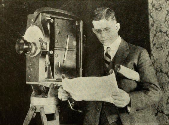
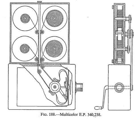
Multicolor was an actual 2-strip process. To shoot Multicolor, any regular motion picture camera could be adapted by replacing the film gate with one modified to fit the thickness of two layers of bipack film. Bipack was first used with glass plate negatives for the original Kodachrome still process, and then used in cinema cameras for Kodachrome's two colour process, Prizma colour, Brewster Color, Magnacolor and so on.
The genius of Multicolor's bipack camera was that it was much less complicated than Technicolor's System 2 camera. There were no prisms or color filters, just a bipack of two layers of film: one orthochromatic that captured blues, greens and a bit of the yellow spectrum; and the other film layer panchromatic. Panchromatic film captured the fill visible light spectrum, but the orthochromatic film had red dye on the base, so that it acted like a red colour filter: only passing the red spectrum to the panchromatic film bipacked in behind it. The same bipack process was used in the Technicolor IV camera on the Aperture II side of the prism for a red/blue separation.
To build a digital version of the Multicolor camera, we need to duplicate each strip's effect. Like my other articles on Technicolor, I'll use After Effects as my engine for doing all this. If you're following along at home, use whatever compositing system you have at hand, but I'll speak After Effects for the descriptions and hopefully that will translate.
Like the Technicolor II and III digital processes, there's a few parts to the camera.
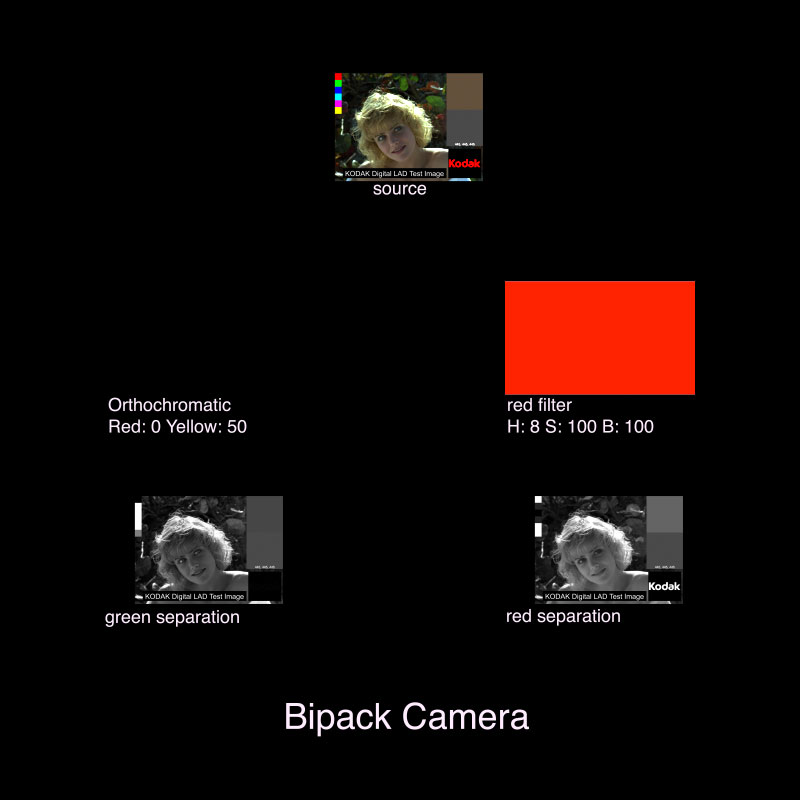
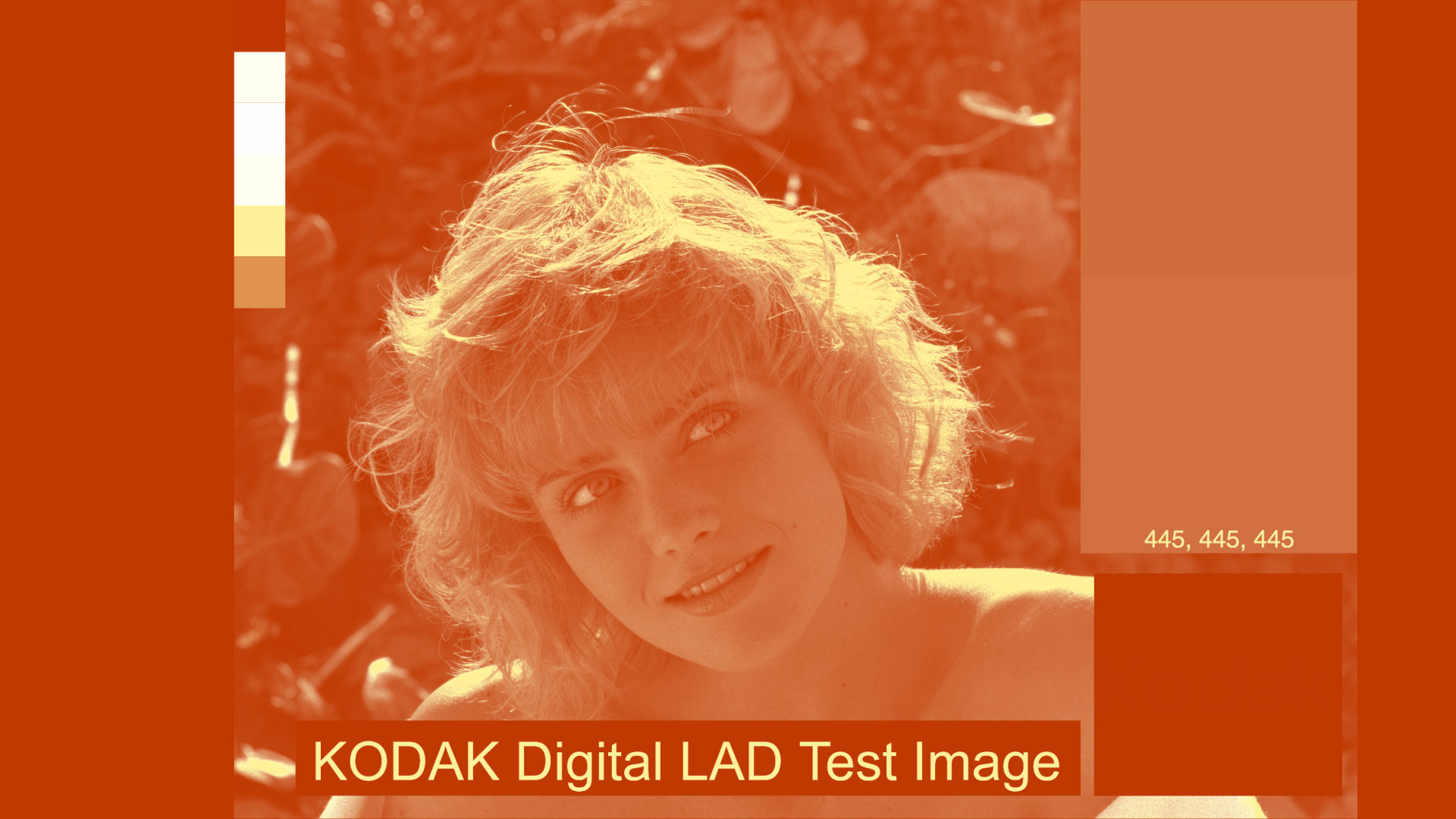
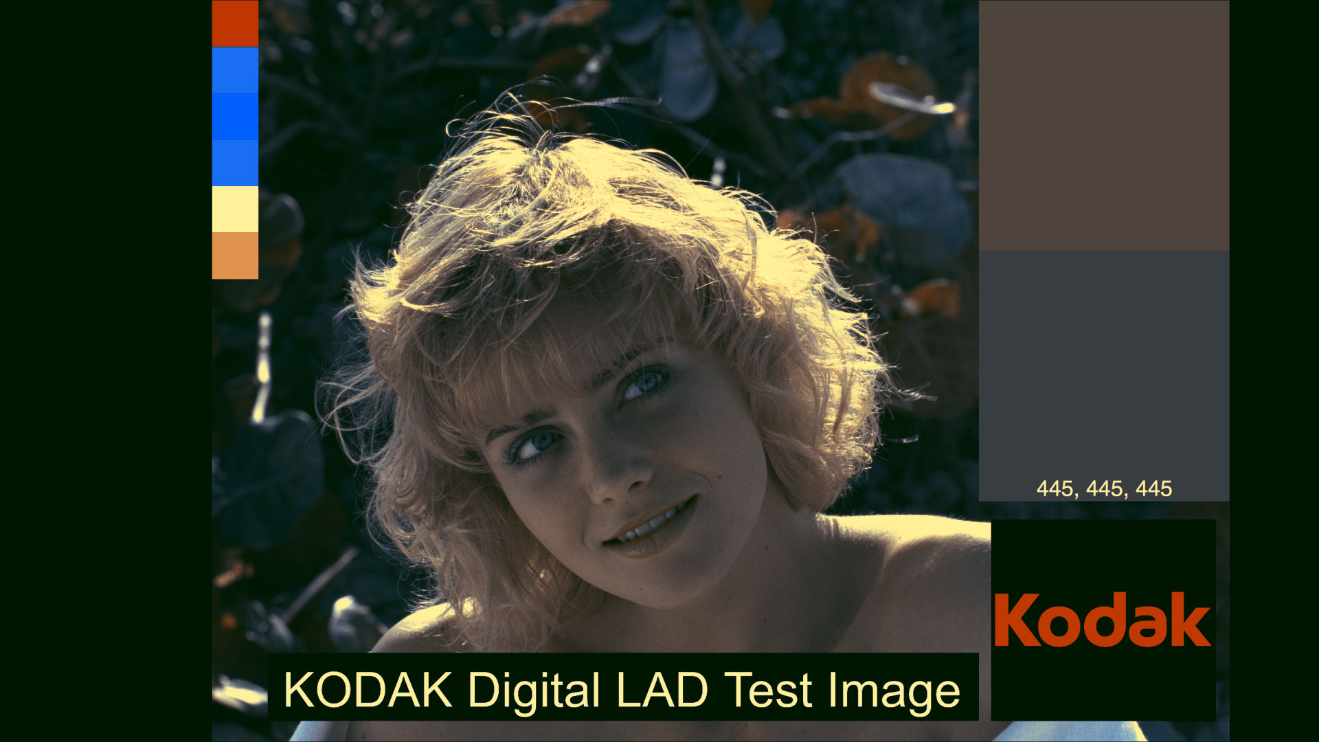
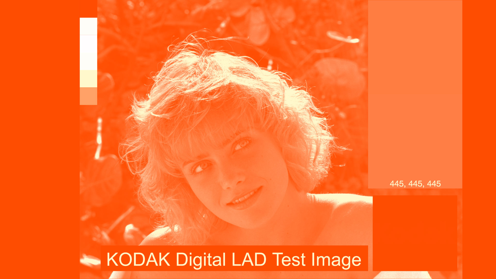
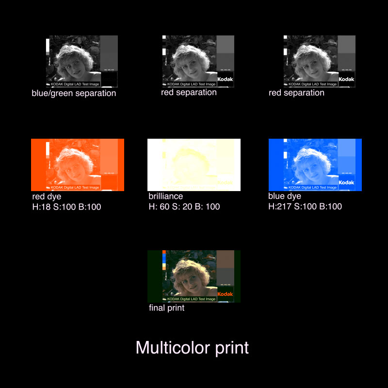
- The lens, of effects of which we can ignore for this process, but this will be the Source image. I'll use Marcie, the Kodak Digital LAD image.
- The orthochromatic film layer, which records blues, greens and a smidge of yellows, but not red.1
- The panchromatic film layer, from which light has passed through the transparent but red-dyed orthochromatic film layer. The panchromatic film records the full visible light spectrum, but because it has been filtered by the equivalent of a Wratten 23A red filter, the film only receives red light.
Yes, both the ortho and panchromatic layers are film stocks, but I will ignore all the specialness of film curves, film responses, and all that goodness that gets wrapped up in film look LUTs these days. I am just modelling the process of the colour effects. If you want to do a film response simulation I would suggest adding it in later, or as a convert-to-log before this process and then log-to-whatever film print stock you want.
So, for a digital version of the camera,
- put the source image into a new comp, call it source.
- put the source comp into two new comps. Call them Blue/Green separation and Red separation.
- In Blue/Green separation, add a new adjustment layer above the source layer and name it Orthochromatic. To make the ortho effect, I'll use the Black & White effect, because it will convert to grayscale and provide control over what parts of the light spectrum are used, much like orthochromatic film. Ignore the Tint part and set everything to 100 (to pass through all the spectrum we want), except for red and yellow. Set red to 0 and yellow to 50, for that smidge of yellow.
- In Red separation, add a new color solid, set to comp size and name it Red filter. Set the colour to the equivalent of a Wratten 23A: Hue 8, Saturation 100%, Brightness 100% and set the blending mode to multiply. Then add a new adjustment layer and name it Panchromatic. Use the Black & White effect again, but this time set everything to 100, including yellow and red.
Right away, we notice a few differences from the Technicolor System 2 camera. Multicolor's red separation is pretty close to Technicolor II and III's red separation, but Multicolor also captures more of the complementary spectrum (blue and green, and that smidge of yellow) with Blue/Green separation instead of just Green.
Here's an outline of the camera part of the process:
The Print
Prints for Multicolor were done one duplitized stock, film with an emulsion on both sides. The red record was printed on one side and the blue/green record on the other. The magic used to make this happen was... coloured light and filters. The genius of the process was to color the print stock yellow, and use blue light to print the image on to the raw stock. The blue light won't pass through the yellow base, and only expose the emulsion on one side.
The exposed sides were then developed, making positive monochrome prints, and then floated across a tank of toning solution of red uranium2 on the blue/green record, and blue ferric ferrocyanide for the red record. It was simple, cheap and it worked. It didn't require a messy glue process that failed on projection, like Technicolor II, or a dye transfer process that took years to perfect and a massive printing press for the imbibition process of Technicolor III.
Let's have Russell M. Otis of Hughes Development Co. in sunny Los Angeles California, present us with a description of the process:
In printing, the two negatives go through the printer together, with a positive film between them. The positive film carries an emulsion on each side of the film support so that each positive emulsion is in contact with its negative emulsion. The two positive images are printed simultaneously by light coming from each side through one negative. The positive emulsions are blue-sensitive and carry a yellow dye to prevent light from one side exposing both emulsions. With the highest light used in printing, there is no exposure of the emulsion on the opposite side. The yellow dye washes out in the development process.3
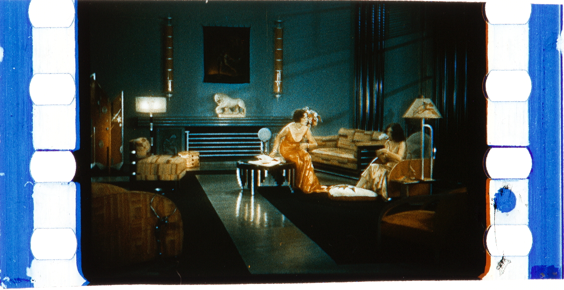
Taking a look at the frame from a Multicolor print, I see:
- the blue/cyan toning, on the sides that should give a good sample for a digital model,
- the red dye leaking from the side, another good sample, and
- lots of yellow in the highlights, evidence of some yellow added in the printing process. I also see lots of yellow in the skin tones, and a green wall, which is impossible to get by only combining blue and red dye layers.
But if the yellow filter dye is washed out in the development process, where does the yellow come from? Russell M. Otis left a few more clues.
The first operation of this machine is to apply a blue iron tone to one side of the film. Neglecting the washes, the film is then immersed in red toning solution which tones the image on the other side, leaving the blue image unaffected. This red uranium tone serves also as a mordant for a dye which next follows and which adds brilliance to the red image. The film is then passed through hypo after which it is washed, dried, and varnished. This varnish greatly increases the life of the print, which is now ready for the projector.3
Aha, Russel M. Otis, we have your process now. Red is a mordant for a dye adding brilliance! But what is this brilliance, and more importantly for our digital model, what colour is it? Luckily, we have a sample of a damaged print from the Library of Congress, that reveals it all.
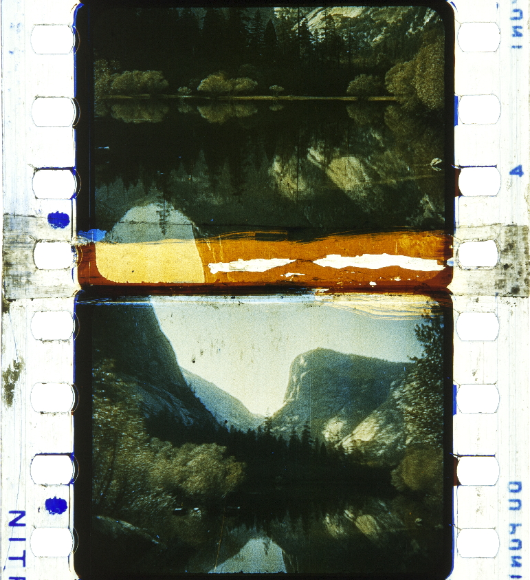
Yellow, and a yellow we can sample. Thank you, Library of Congress.
With all this information, let's build a print. In After Effects,
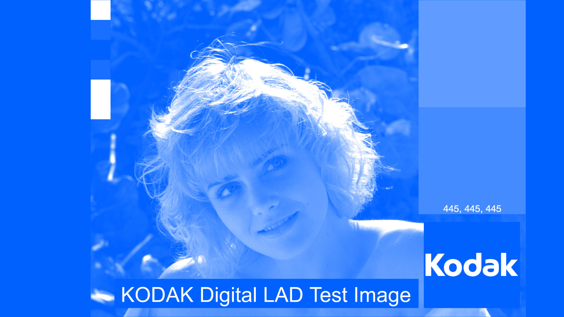
- Take the Red separation, put it into a new comp, and add an adjustment layer with the CC Toner effect. CC Toner is great for simulating, well, toning. Use the Duotone tone setting. What it does is replace a highlight colour or shadow colour with a colour of your choosing. Leave the highlights alone, as white, and set the shadows to hue: 217, saturation: 100%, brightness 100% (which I get from sampling the blue dye from the example prints).
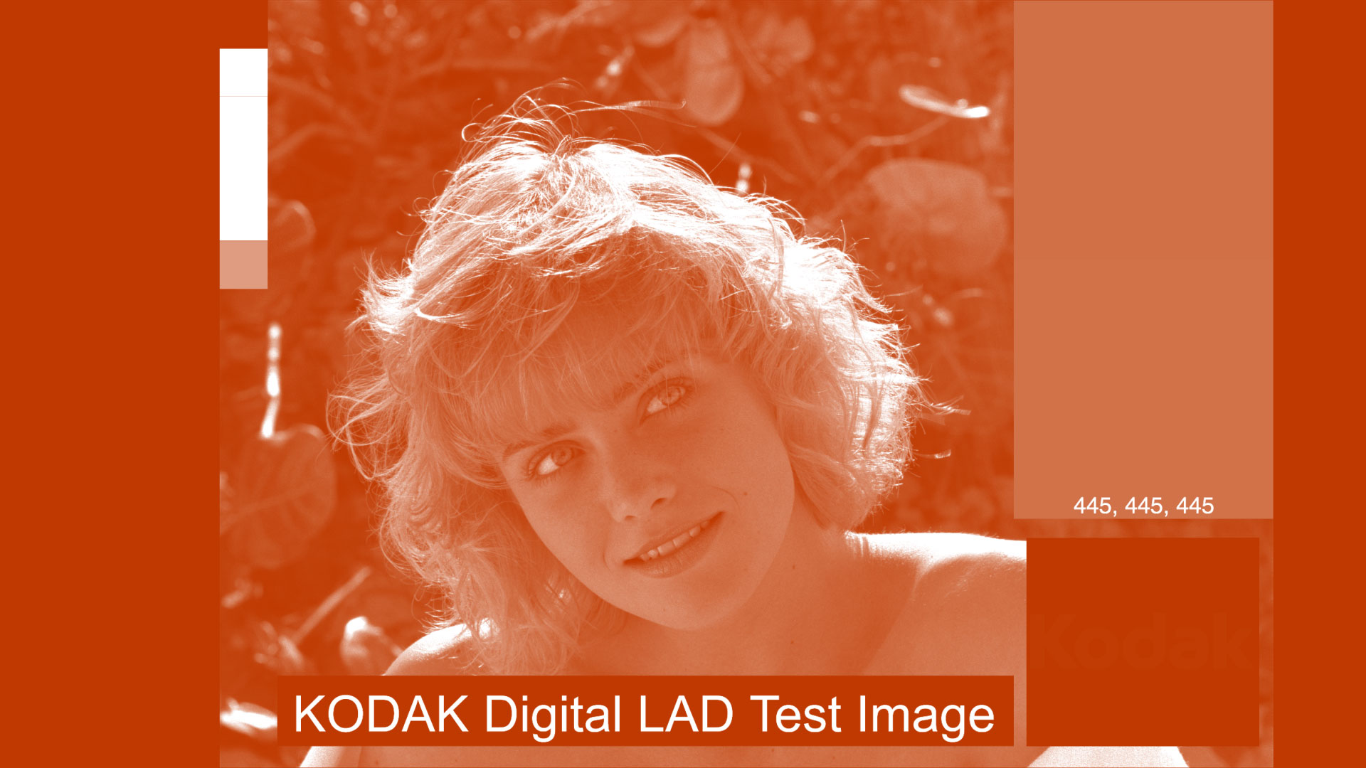
Blue dyed side - Take the Blue separation, put it into a new comp and add CC Toner with an adjustment layer. Set to Duotone and set the shadows to H: 18, S: 100%, B: 75%. Why Brightness at 75%? The example prints red's are a bit deeper, at about 75% brightness of that hue. It seems to work.
Red dyed side - And now for the Brilliance, put the Blue separation into a new comp and add CC Toner with an adjustment layer. This time, set to Duotone and the highlights to the sampled colour of the yellow brilliance dye, B: 52, S: 40%, B: 100%.
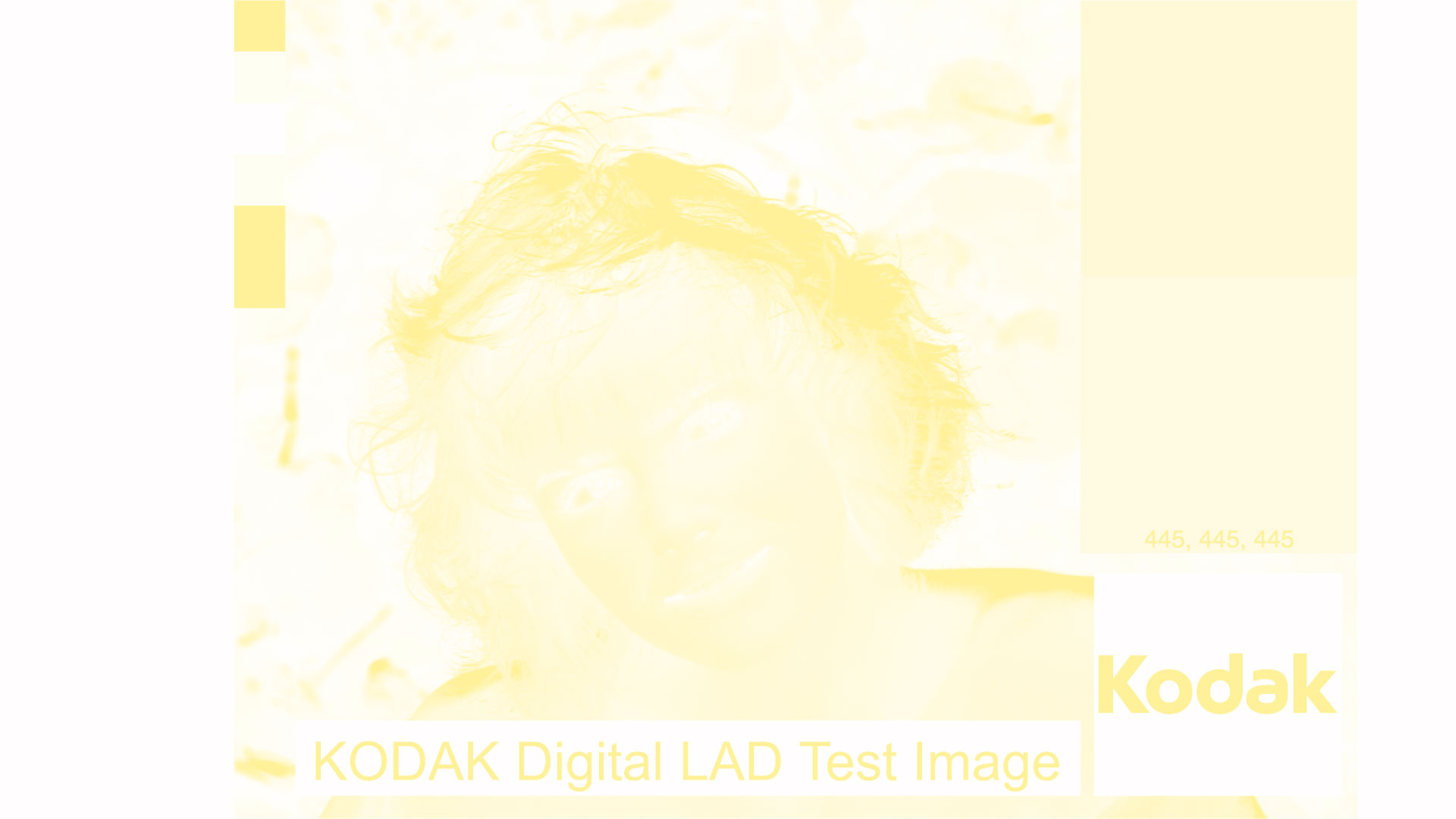
Brilliance on highlights only
Final Print
With all these elements ready, let's combine them. Make a new comp and put in the Red Dyed layer, and multiply in the Brilliance. This is the digital equivalent of the red dye acting as a mordant (preserving darks) and leaving the light areas to be affected by a yellow tint (in the highlights).
Then, in the same comp, multiply in the Blue Dyed layer.
Compared to a Technicolor III digital print,
It's a little dark, and those highlights are just too much.
So, let's fix that. The darkness is fixed by making the red dye's brightness 100%.
Add in the Brilliance, this time set at 20% Saturation.
And put it all together again.

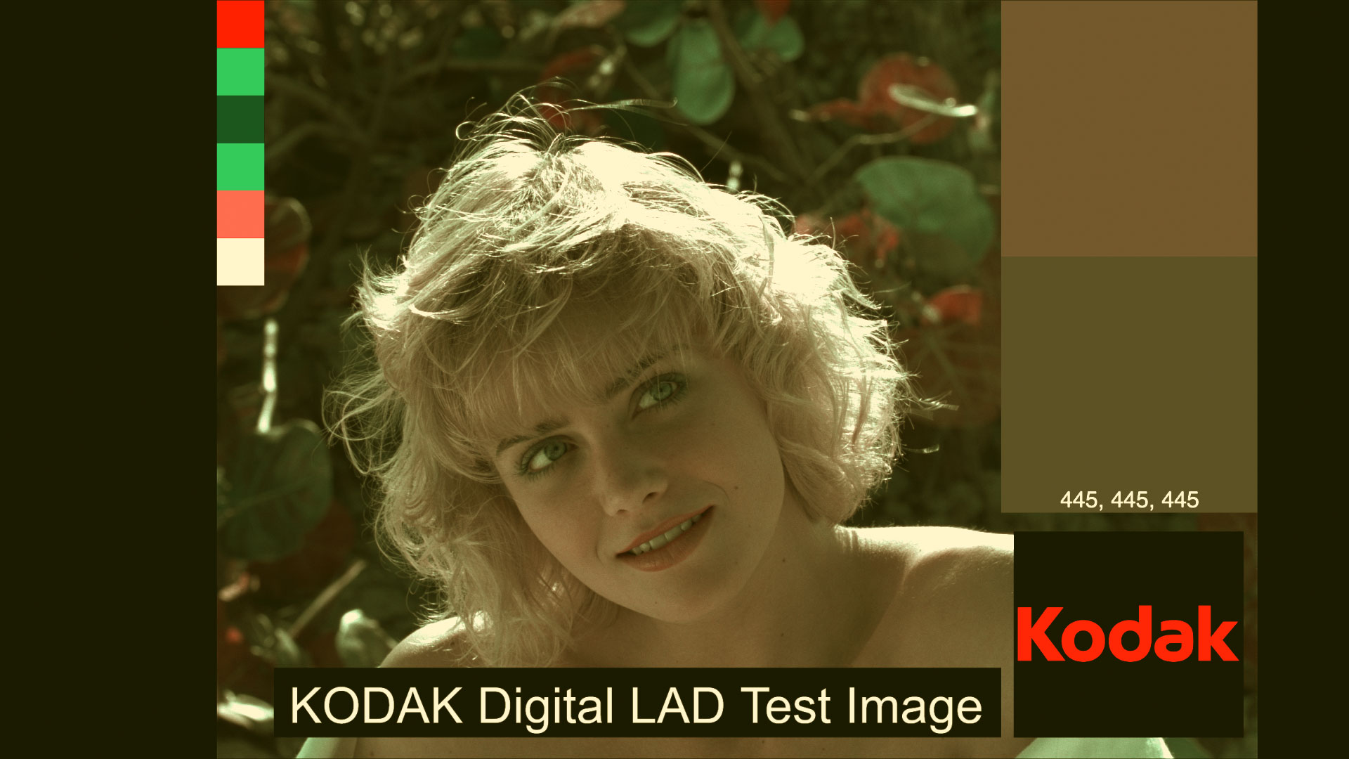
It's looking brighter and less golden hour, but for my tastes, it's still a bit magenta in the skin tones and a not golden enough. So I'm going to shift the brilliance a bit to H: 60, S: 30, B: 100.
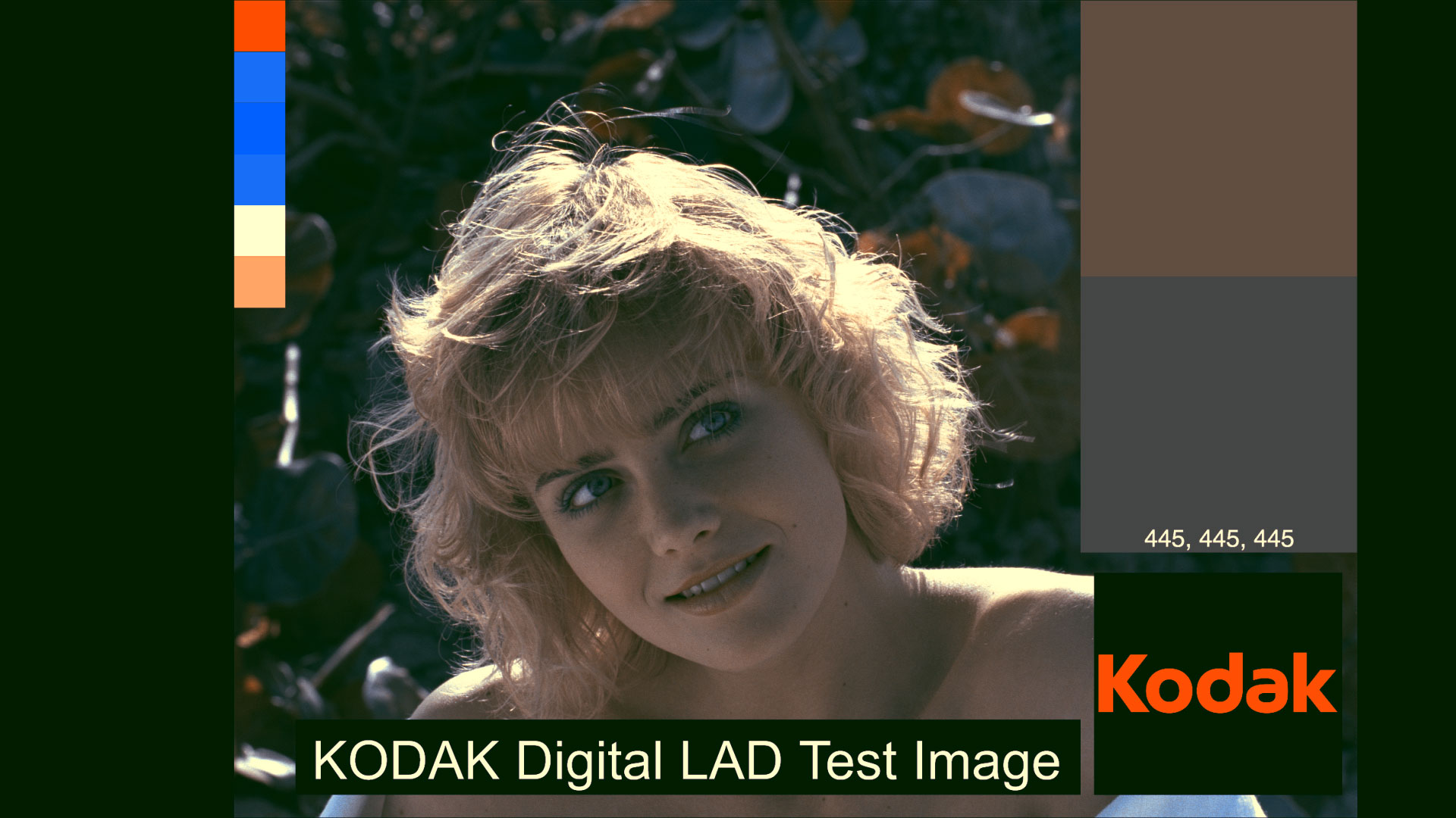
Now we have decent skin tones, slight brilliance, some pseudo green on the leaves, and an interesting alternative to Technicolor III. Time to open a Hollywood production facility and start cranking out prints for Hell's Angels, Mr. Hughes.
Oh, but wait, Hell's Angels actually did want Multicolor prints for release. The only problem was, Multicolor's facilities couldn't keep up with the number of prints Mr. Hughes needed to recoup his investment of $2.8 million and get the film into as many theatres as possible. So, he had to turn to Technicolor to make the prints.
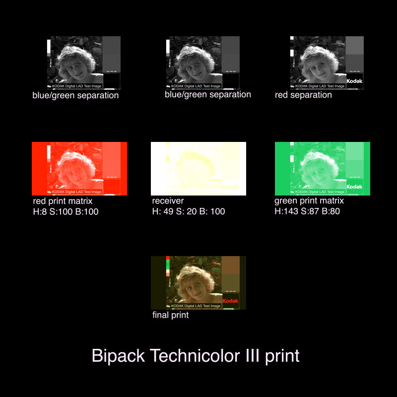
We can do that too. Let's put a bipack shot into Technicolor III and see what happens. Note that this doesn't use Technicolor's filtering of red and green for the separation, but bipack's red and green/blue. Let's see a shot from the film for reference.
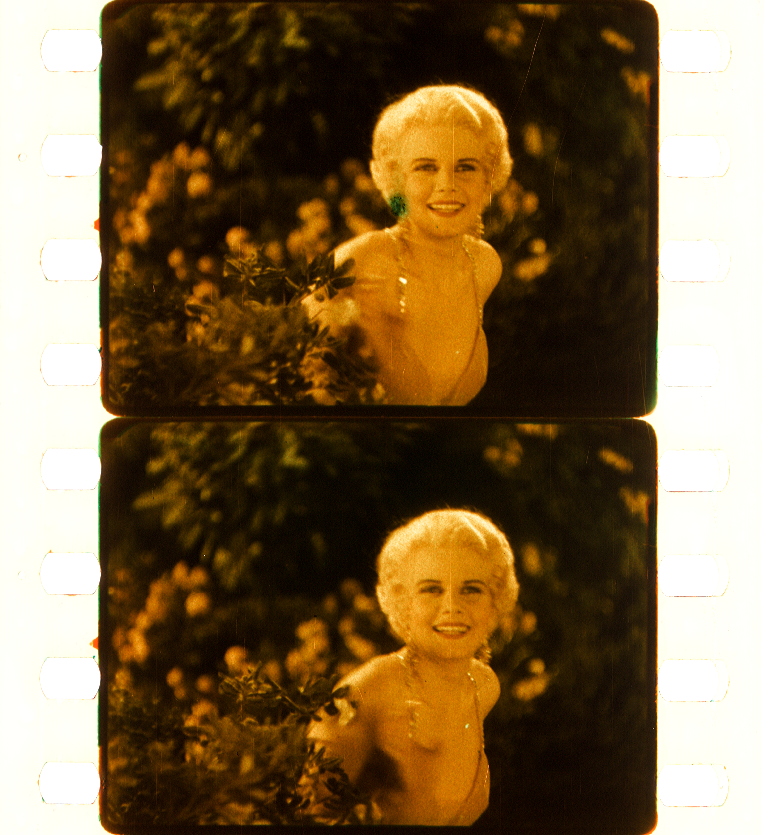
Jean Harlow is looking pretty brilliant yellow. Also note that swirly bokeh.
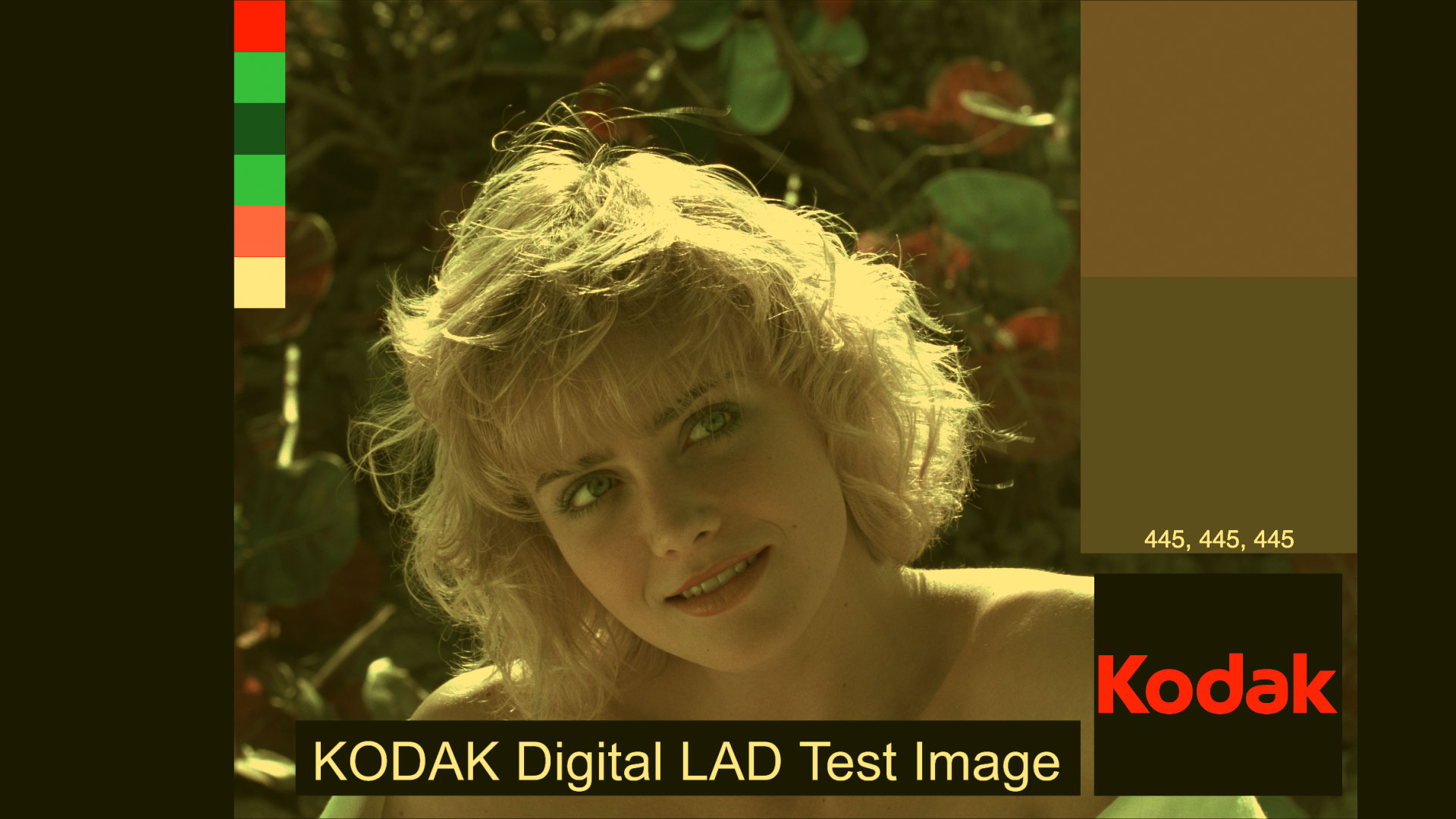
So, if I run the sample of bipack Marcie through my Technicolor III process, I get:

The result is interesting, but nowhere near the look of Hell's Angels. Hell's Angels was released in 1930, right at the end of the Technicolor III era, just before Doctor X in 1932 and Mystery of the Wax Museum in 1933, when Technicolor had the process down and was able to do a lot of manipulation of the image in printing. So let's do that too.
Before we do, let's just compare Marcie to an image using the digital Technicolor System 2 camera.
Just looking at the color swatches, red is just as saturated with the bipack camera as with the Technicolor System 2 camera's green filter, which it should because orthochromatic can't see red at all and records it as 100% not there, or at full density (which is then dyed red: green filted, dyed red). The system 2 camera does do a good job of making green and blue separate, where bipack camera records green and blue as almost the same value.
Of the lower 3 swatches, cyan comes out green in both, magenta is filtered by both sides of the bipack camera, and partially detected by System 2's green filter and printed as light pink. Yellow is detected partially (that 50% I used in orthochromatic) by bipack, but unseen by System 2. It's an interesting set of trade offs for skin tones coming out pretty close using either capture system.
Looking at the Bipack Technicolor III print, Marcie's skin tones come out a little too red. That's due to that extra density from the yellow capture with blue and green that then gets printed red. That extra density will pay off in a minute with a few adjustments.
Looking back at Jean Harlow from Hell's Angels, she is very yellow. That means that Technicolor did their thing (that I suspect) where they manipulated the receiver tanning for more yellow, either through the print density or by increasing the amount of tanning. None of these things I've been able to find documented, but I'm guessing it from the varying degrees of yellow I've needed to add in my digital models to match the look. So, I'll add in more yellow in the Technicolor III receiver by increasing the saturation from 20% to 50% on the Multicolor Bipack with Technicolor III printing.

Now it's looking pretty close. It's not the same image or lighting, but we have yellow hair highlights, that dramatically yellow fill on the skin tones. Compared to a System 2 camera Technicolor III with the pumped up tanning,
A System 2 camera shot Technicolor III print doesn't have that orange skin tone. It's more yellow, and subtle.
Print workflows
LUTs
I'll make LUTs available on the projects page.
Notes
-
See Ilford ORTHO PLUS film's technical data sheet for a graph of the spectral sensitivity of orthochrmatic film. It records blue and green with normal response, and sharply drops off between green and yellow at 570 nanometers. I'm saying that means it records a smidge of yellow in my digital model, but not all.
-
Yeah, uranium. Not only was the people developing the prints shortening their life through exposure to developer and fixer, but also with radiation.
-
Otis, Russell M. (1931): The multicolor process. In: Journal of the Society of the Motion Picture Engineers 17, 1931, pp. 5-10., from filmcolors.org.
Published Tuesday, December 20, 2022.