SuperCinecolor 1951-1954
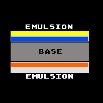
The problem Cinecolor was trying to deal with by the late 1940’s was that their colour process wasn’t competing with Technicolor’s three-colour process, because it wasn’t full colour. The answer to the problem was obvious: build a process that captured three-colour and printed in full colour. Capturing three-colour was easy. Eastman had just come out with Color Negative Safety Film, Type 5247, that could be run through any existing camera without modification and could be used to create three-colour separations in post production. The difficulty for Cinecolor was creating a three-colour print with their duplex-film dye process, which meant they had to figure out a way to add a third layer of colour emulsion to a film that only had two sides of emulsion to work with.
Three colour works by using three colour separation density maps from the original – black and white colour extractions using a red, green and blue filter – either in-camera as in the Technicolor IV camera or by filter passes of a source image as was used for animation. 1 In the print process, the three colour separations are dyed with complementary colours, e.g., the Red separation gets dyed with Cyan, and so on.


Clearly you need a medium to hold all three colours. And Cinecolor found a way, through some crazy genius chemistry and experimentation, to print and dye one colour on one side of duplitized film, using only part of the emulsion, then adding a second colour by printing a second image and dying it on the remaining emulsion, then adding the third colour on the opposite side emulsion. 2
How did they perform this magic using the same horizontal machine used for two-color Cinecolor? Well lucky for us, we have access to the recipe:3
- Black and white development. The red and green record prints and the sound track were developed to black and white silver images. The yellow dye contained in the print film was bleached out during development.
- Wash and squeegee.
- Cyan (blue-green) toning. The print was floated on the surface of the cyan toning bath with the image from the red record and the sound track facing down.
- Wash.
- Immersion in a solution which converted the silver ferrocyanide to silver bromide.
- Wash.
- Harden.
- Wash and dry.
- Removal of film from the machine for the blue record printing.
- The blue record negative in contact with a low gamma negative mask printed from the red separation positive was printed onto the side of the duplitized positive containing the cyan image and the re-sensitized silver bromide.
- Black and white development. The print was floated on the surface of a black and white developer with the exposed image facing down. This resulted in a positive silver image which would be dyed yellow later in the process.
- Wash.
- Fix.
- Wash.
- Pre-dip. The print was immersed in an acid solution of potassium iodide.
- Mordanting solution. Oxidizing bleach which converted the silver images (blue and green records) to a dye mordant.
- Clearing bath. Clear in a 2% solution of sodium bisulfite.
- Wash, squeegee, and dry.
- Yellow dye toning. The print was floated on the surface of the yellow toning bath with the image from the blue record facing down. The mordanted image accepted the yellow dye according to the magnitude of the mordanted deposit.
- Wash.
- Magenta dye toning. The print was immersed in the magenta toning bath. The mordanted image accepted the magenta dye according to the magnitude of the mordanted deposit.
- Wash.
- Cyan regenerating bath. Print was immersed in a solution of potassium ferrocyanide (25 grams/liter).
- Acid rinse in hydrochloric acid.
- Wash, squeegee and dry.
Let’s make sense of all this for making a digital model.
- Red record gets printed Cyan on one side of film with the Soundtrack. (Steps 1 to 3.)
- Green record is also laid down on opposite side of film, but not coloured yet. (Step 1.)
- Blue record is filtered by low gamma mask of red record and printed on Cyan side of re-sensitized film. (Step 10.)
- Blue and Green records are prepped for absorbing dyes (mordanting, Step 16. Not needed in our digital model, because we’re not doing chemistry.)
- Blue record is dyed Yellow. (Step 19.)
- Green record is dyed Magenta. (Step 21.)
- Cyan is regenerated. (Step 23. Also not needed in our digital model, because we’re not doing chemistry, but this is the photochemical magic that made this all happen.)
If you ever think doing quality control checks on your online is hard, think about these guys doing 25 painful, careful steps in a stinky photochemical factory, burning out their nose hairs and probably shortening their life.

It looks like we pretty much have everything we need to make a digital model of the print process, except we’d better take a look at a final print to confirm everything and maybe get colour samples of the print dyes. There isn’t many examples to see, since SuperCinecolor didn’t last very long on the market, but we do have some images of Gloria Swanson from 3 for Bedroom C (1952).
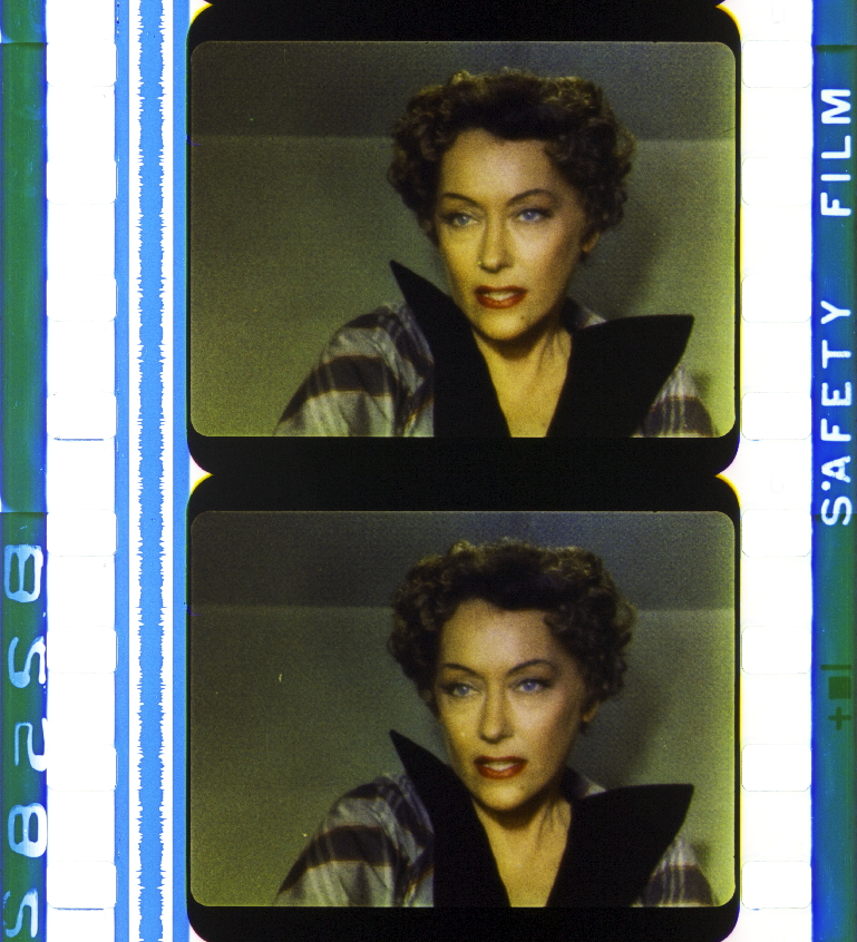
Cyan
Wait a minute, that soundtrack is supposed to be cyan. It looks more like the Prussian Blue hue to me, more like the blue hue from Cinecolor. If we go back to our full 3-color model from before,
The cyan hue in the model looks quite different from the soudtrack’s hue.
The reason, I think, is that the soundtrack needed to be the same dye as Cinecolor. Cinecolor’s soundtracks were it’s weak point. Most film projectors were calibrated to read a black soundtrack with a photocell. Blue sountracks were read more like a dark grey by the projector’s photocell. Cinecolor corp’s solution was to use a yellow filtered photocell to assist. Not many theatres installed the yellow photocell, but those who did benefitted. With SuperCinecolor, the ask was to install another special photocell, which probably wouldn’t fly. So Cinecolor corp made a compromise, used the same Prussian Blue and called it cyan (which is sort of was, just not the cyan needed for full colour.)
From the Gloria Swanson from 3 for Bedroom C (1952) image, I sample the Prussian Blue soundtrack as Hue 212, closer to the Hue 223 I used in my digital Cinecolor than pure cyan.

With Prussian Blue as the cyan, blues stay blue, cyans get shifted to lighter Prussian Blue and greens go darker. It’s not a bad compromise really, at least in theory, because those colours aren’t so dominant in The Movies, just in real life colour accuracy.
Yellow
For Yellow, we don’t have the advantage of a pure yellow streak of colour on any of the sample prints, but there’s some parts that are close. On the Gloria Swanson frames from 3 for Bedroom C (1952), there is some yellow spill on the beveled corners of the frame. Sampling those, I get a hue of around 55 or 56 degrees (on a HSL colour). To confirm, we also have this sample,
Sampling the yellow swatch with the 3 on it, gives me a hue 55 or 54 degrees. The problem with that sample is that it’s in the frame and generated from a colour that has run through a camera, and might not be all yellow in dye. It looks yellow, but I don’t completely trust it. Lucky for us, there’s a really good potential sample of yellow bleed on the side of the frame, running along the bottom. From that, I get 57 or 58 degrees. I’m going to go with 57 degrees because it seems the most consistent.
Putting that in our three colour model gives us:

Hue 57 Yellow doesn’t effect Red at all. Black stays black, but green goes a little darker. Still not too bad.
Magenta
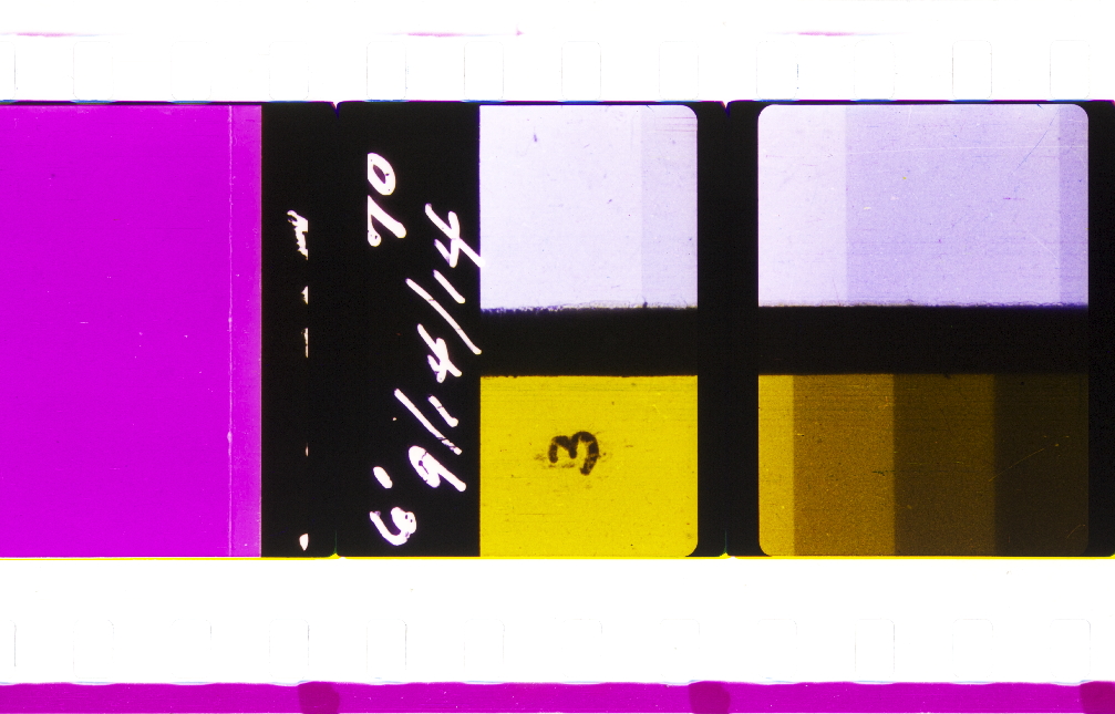
In comparison, the George Eastman House Moving Image Collection, item no. 75:7:0048 image makes magenta sampling too easy. It gives us a lovely, solo strip of magenta running down the side of the film. It looks to me like this preserved sample of SuperCinecolor was from a test, because there was no soundtrack printed. Did it use a production set of dyes? Could we even say there was a production set of dyes, since SuperCinecolor didn’t last very long? I don’t know. But someone thought this was a good sample to preserve, and it’s our only good sample at this point, so let’s try it.
From the magenta strip, I sample magenta’s hue as 303. From the magenta swatch in the frame I sampled Hue 296. I’m going with Hue 303. Putting that into the three colour model produces:

Blue now goes just a little bit darker. Comparing this to the ideal:
Blue almost matches the ideal. It’s cyan and green that is vastly different.
If we run a real-world image through this process, like the good old Kodak Digital LAD, we get:
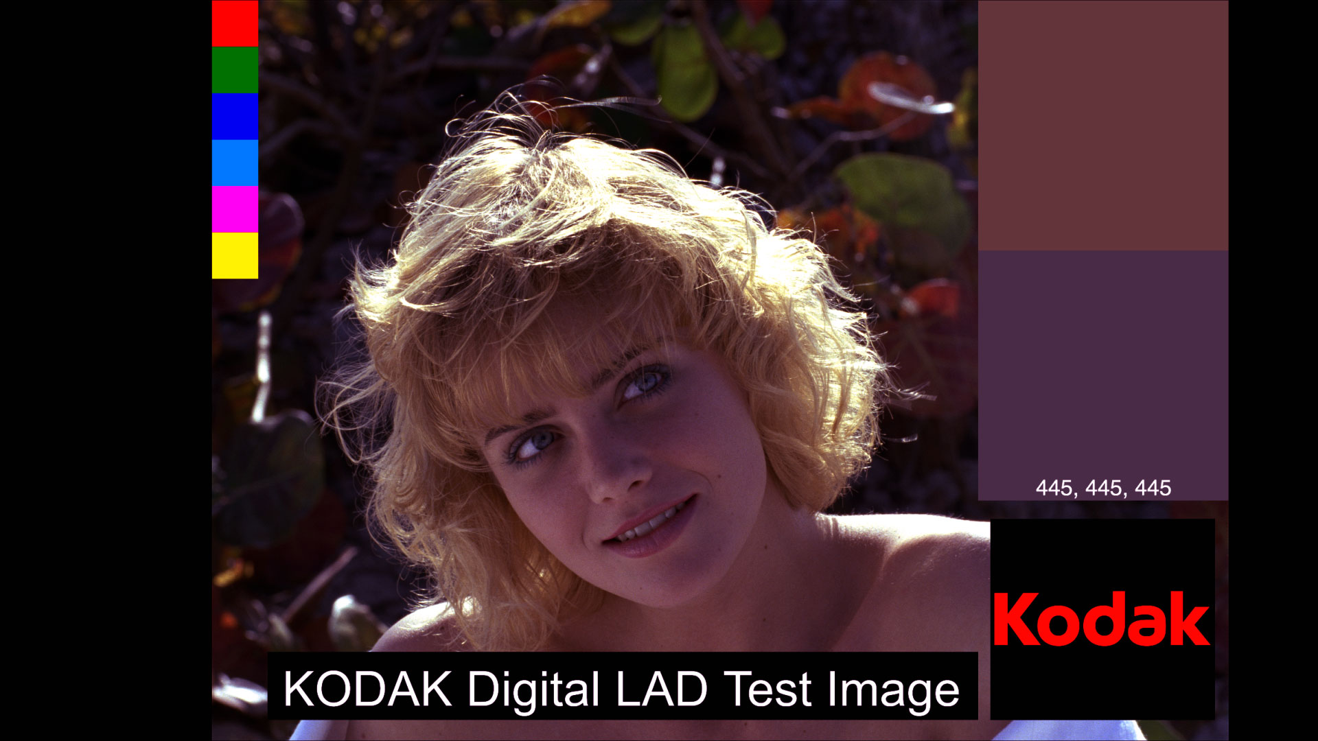
It’s not the worst result I’ve gotten from putting together an image using these colour models. The grey patch is lacking green, which makes everything seem a little off, but it’s not horrible. The RGBCMY colour swatches are quite interesting, and it’s definitely a look. But the skin tones do not look like Gloria Swanson’s yellow, so there must be more to SuperCinecolor that I'm not modeling yet.
The camera
Ok, this part is not technically the camera part of the model, but the name is the one I use for the pre-print side of the capture of the colour channels. SuperCinecolor shot Eastman colour film, which I’m not going to model the colour response. Just pretend that the digital image generation is the equivalent. What I am going to model is what Cinecolor did to generate their colour separations from that negative.
Going back to what I made sense from the SuperCinecolor recipe, we have:
- Red record gets printed Cyan on one side of film with the Soundtrack. (Steps 1 to 3.)
- Green record is also laid down on opposite side of film, but not coloured yet. (Step 1.)
- Blue record is filtered by low gamma mask of red record and printed on Cyan side of re-sensitized film. (Step 10.)
- Blue and Green records are prepped for absorbing dyes (mordanting, Step 16. Not needed in our digital model, because we’re not doing chemistry.)
- Blue record is dyed Yellow. (Step 19.)
- Green record is dyed Magenta. (Step 21.)
- Cyan is regenerated. (Step 23. Also not needed in our digital model, because we’re not doing chemistry, but this is the photochemical magic that made this all happen.)
So the ingredients we need for this are:
- Red record
- Green record
- Blue record filtered by low gamma mask of red record!
Interesting. Maybe that filtering step is what helps balance the weird use of blue instead of cyan in printing. Let’s put this together and see.
Separations
First off, how did Cinecolor generate red, green, and blue separations? From the patent on SuperCinecolor, US2226339A – Three-color film and method of making same, by William T Crespinel, we have this description:
In the practice of my invention, I first produce three suitable color-value negative-printing films by any well-known means that will insure their color separation. These negatives may be produced by various types of cameras adapted to expose the individual negatives through appropriate filters so that they will record red, green, and blue color values respectively, or by any other suitable means which will give proper color separation. The three filters used may of course vary as to their exact spectral ranges but in general they will comprise those portions of the spectrum which are generally termed red, green, and blue.
I’m guessing William T Crespinel was either stating an obvious method, or he wasn’t involved in the camera side of things. Either way, there might be more of a hint by Alen M. Gundelfinger, in the Journal of the Society of Motion Picture and Television Engineers 1950-01: Vol 54 Iss 1 (page 85):
It may be of interest to state at this point that the conversion factors from densities, as read on the E.R.P.I. densitometers, to analytical densities are 1.20, 1.30, and 1.40 for the cyan, magenta, and yellow components, respectively, when read through the Kodak Wratten 29, 61N, and 49 filters.
Funny he mentions Wratten 29, 61N and 49 filters, which are three wratten filters used for making colour separations. But it gets more complicated than that. Wratten Light Filters, 9th Edition lists three other filters (pg 8):
The standard Wratten set of three-color filters consists of A, No. 25; B, No. 58; and C, No. 49. These are recommended for tricolor reproduction work of all kidns and, where possible, for general three-color photography.
And finally, Kodak recommends Wratten 29, 47, and 61 for tricolour separation work.
So what to do? Wratten filtering is a art and science of it’s own, useful when shooting photochemical (that is, film stock) and adjusting for things like daylight, arc lights or tungsten lamps. These are the things people had to do before they had computers, software and digital imaging pipelines to practice the craft of cinematography. Just take a look at the different filter combinations, from Wratten Light Filters, 9th Edition, used to correct for daylight, white flame arc lamps, tungsten lamps, or the thirty filters available – ten in each colour – for creative explorations.
Also Wratten filters have updated over time. Some aren’t available any more, some are replaced. What’s important is to use a set of filters matched in density. So let’s use Wratten 25, 47, and 58, because they still exist and I have this photo of them to take samples.
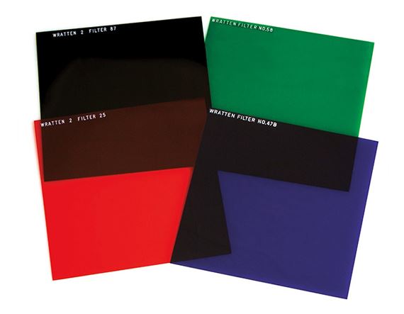
From my eyedropper samples, I get:
- Wratten 25: Hue 359
- Wratten 58: Hue 123
- Wratten 47: Hue 244
Put these together in a colour model and adjusted for maximum brightness and saturation I get:
Which looks pretty good. Each colour is pretty much filtering out all the other colours. There’s a bit of red in the blue-red, a bit of blue in the blue green, but that’s filters and photochemical for you. Those imperfections are what give it a bit of character.
Blue filtering
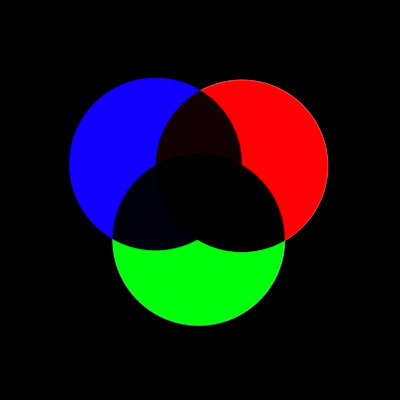
The last thing we need to try is filtering the blue record with a low gamma mask of the red record. Why did Cinecolor choose to do this? Let’s take a look at this colour diagram from Technicolor’s documentation.
The circles with the solid lines are the colours used for separations, so blue would be the blue record. The circles with the dotted lines are the complementary colours used for print dyes. Physics is physics everywhere in the universe, so what worked for Technicolor also worked down the road at Cinecolor.
So, with this model, blue gets dyed yellow. So when we’re attenuating the blue record with filtering, we’re darkening it and deepening the saturation (deeper black feeds more yellow dye into the print). More yellow alters the balance towards a more yellow print, which as far as I can guess was an aesthetic choice of the time. Technicolor IV had the gold mirror that added the same kind of look. Technicolor III had yellow tanning. Multicolor had yellow brilliance added. Cinecolor had yellow dye not washed off (or maybe added in like Multicolor) in the print process.
This is now Gloria Swanson gets her yellow in her flesh tones: aesthetic choice.
How did the filtering work? I haven’t found any exact details other than the “low gamma mask of the red record”. So lets break it down. Starting with the blue record, created in After Effects by multiplying a solid blue using Wratten 47: Hue 244, Saturation 100%, Brightness 100% over the source image, and then doing a my panchromatic film effect by adding an adjustment layer and using the Black & White effect with everything set to 100.

We do the same thing for the green record and the red record, but use the correct filters, Wratten 58: Hue 123 for green and Wratten 25: Hue 359 for red. Here’s red.

For the filtering, we’re going to simulate stacking two physical pieces of film and then putting light through them to make a print. Now back in 1951, this was done with negative film for the blue record and a positive print of the red record, both sandwiched to a receiving emulsion and run though film printer lights to make the exposure, then the receiving emulsion was developed to print a positive. Sounds complicated and it was a bit. We get off easy in digital. We just use a Multiply blending mode.
So, take the blue record, layer it with the red record and use a multiply blending mode on the red record, and we get this,

I would say that is too much filtering. So let’s make a low gamma mask of the red record. Low gamma is a tricky term because gamma has a lot of meanings. Gamma in video is a numerical expression of the slope of a log curve of signal to exposure. Gamma in film is a measure of contrast.4 So low gamma in this case means low contrast, in the film sense.
How low? Well, from experimenting with this, I think it’s really low. Like really really low. What we want it to just add a little more density (darks) to the shadows of the blue record, enough to add just a bit more yellow to the balance in the print.
I created really really low contrast using the CC Toner effect on the red record. Setting it to duotone, to only effect highlights and shadows, I left the highlights alone and set the shadows to Hue 0, Saturation 0%, Brightness 85% – down 15% from white and adding only 15% of the red record to the mix.

If we now multiply the really really low contrast red record onto blue, we get,

Note that we with the filtering, we’ll get a bit of yellow printed into blue and cyan (from the light grey on the blue and cyan colour blocks). How does it effect the final print? Here’s a before and after.


I think it looks nice. A little deeper Prussian Blue and a little more warm yellow tone.
One more thing
The only problem I have now with this result is how unbalanced that grey patch is. It looks too magenta to my eyes. Technically, the image is laking a proper cyan, because Cinecolor used Prussian Blue instead of cyan, so the greens are dark and the cyans are more blue than cyan.
Cinecolor saw this too. What they did was a kind of cheat, in the film sense, which is doing something sneaky to make the end result look good. Movies aren’t reality, they are tricks, just like 24 pictures per second makes things appear to move or when an actor looks in a mirror and the camera sees their reflection. So if a grip can ball up some gaff tape to adjust a mirror so the reflection appears as we would imagine it should be, you can bet Cinecolor had the artistic license to adjust colours to make things appear to be balanced. So let’s do that in our model.
Going back to the George Eastman House colour print test, I’m going to put all the images from the collection back together in a strip.
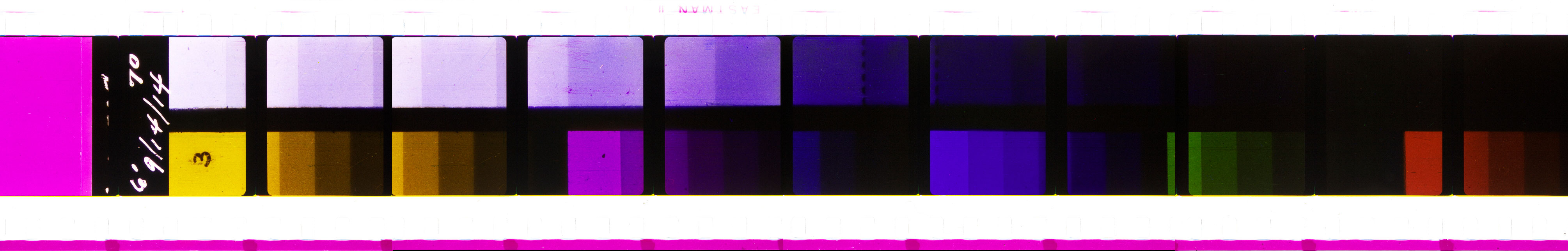
Here we see all the colours that SuperCinecolor can replicate: Magenta, Yellow, Blue, Green and Red. But no Cyan, just a lighter version of blue. This image confirms that all the reasoning about how SuperCinecolor works is ok up to this point.
But what I missed was that Magenta strip along the bottom of the image. It’s not as bright as the yellow, about 5 to 10% less. Is this how Cinecolor added some balance to the image? Let’s try it and see.
Here’s the image as it stands now with all print colours at 100% brightness.
And if we knock back magenta to 90% brightness we get:

It’s a big improvement in skin tones, and a slight improvement in the grey patch. SuperCinecolor is never going get to completely balanced, but maybe we can cheat it a bit more with some more blue filtering.
What if we adjusted the gamma on the red filter to about 75%?

It’s subtle, but it’s there. More red record filtering on blue darkens the blues in the print, and the trade off is nicer skin tones. I’m pretty convinced this is the way Cinecolor made Supercinecolor’s “look” work, by tuning prints with the low gamma filtering of the red record to adjust skin tones.
As a side note, I also wonder if this filtering stuff got passed on to Rob Legato during his research on making Technicolor for The Aviator and it fed his ideas on filtering the red, green and blue records. I mean, The Aviator’s colour scheme for 2-strip was certainly more Cinecolor blue than Technicolor III green. Maybe he viewed some Cinecolor prints during his gathering reference phase.
What if?
I admire Cinecolor corporation for trying to stick it out and adapt a 1920’s 2-colour process for full colour. It took some genius engineering and chemical knowledge to make it all work, plus a good dash of artistic eye. But in the end, it was doomed to fail. Cinecolor worked in the marketplace and there was new players, namely Eastman color and also Anso color. For a film production, why shoot on Eastman color and not finish it with a colour process that made slightly weird looking prints lacking in part of the colour spectrum (both Cinecolor and SuperCinecolor) when you could just spend almost the same price or less and get full colour with an Eastman colour print?
What they didn’t know, or didn’t care about was that Eastman colour prints faded horribly over time. And this problem persisted all the way into the 1970’s and 1980’s. Lucasfilm famously had to scour film archives around the world for a Technicolor V print of Star Wars (1977) to find an acceptable unfaded reference for the 1997 Special Edition re-release.
So what if Cinecolor didn’t go out of business in 1952 and SuperCinecolor became an alternative to Technicolor? What would it have looked like on the screen? It’s easy enough to find out. I’ll put some stills from Technicolor 3-colour films through the SuperCinecolor process to see how they turn out.
Singing in the Rain (1952)


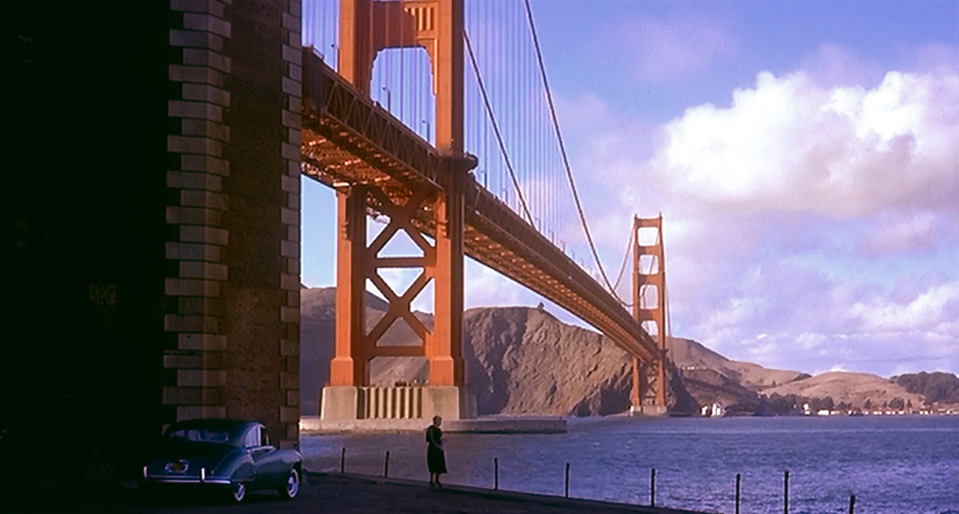
Vertigo (1958)


The Wizard of OZ (1939)
Yes, technically The Wizard of OZ predates SuperCinecolor, but let’s have some fun with it anyways.


Print workflow
Here’s the print workflow for SuperCinecolor.

LUT
If you want to try out SuperCinecolor in your projects, there is a LUT available on the projects page.
Published May 9, 2023.
Notes
The animation camera was loaded with black and white stock, the source frame was put on the animation table, the red filter was put over the lens and a single frame was shot, then the red filter was replaced by green, shot, then by blue, shot and the process repeated for the next animation frame. The three colour separations were shot in sequence on the neg, then step printed onto three positive separations. ↩
Read the full patent description of the process on google patents: US2218001A - Process for making colored prints, Inventor Alan M Gundelfinger, Lyne S Trimble. ↩
from Journal of the Society of Motion Picture and Television Engineers 1950-01: Vol 54 Iss 1, courtesy of the Internet Archive. ↩
I’m paraphrasing from Goodman’s Guide to the Panasonic Varicam, the first video camera manual that made sense to me, coming from a film background. 2004, Robert M. Goodman, AMGMedia Publishers. Page 4 to 5. ↩