Technicolor No. IV 1932-1953
Having made a digital Technicolor No. III , let’s move on and build a digital Technicolor No. IV, the 3-colour dye transfer process used from 1932 to 1953, that we all know and love from films like The Wizard of Oz.
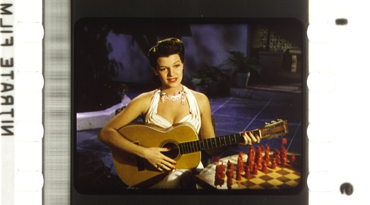
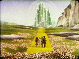 The Wizard of Oz (USA 1939, Victor Fleming). Credit: Images courtesy of the Academy Film Archive. Cropped from the photograph of the dye-transfer print by Barbara Flueckiger, from The Timeline of Historical Film Colors.
A Technicolor IV film was captured on a Technicolor camera that separated the image into 3 components: red, green and blue, and exposed three separate strips of film for each separation.
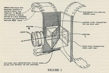 Source: Ball, J. Arthur (1935): The Technicolor Process of Three Color Cinematography. In: Academy Technicians Branch Technical Bulletin, May 31, 1953, 1935 Volume, p. 3.
Each negative was used with a corresponding print colour (cyan, magenta, yellow) that was physically pressed to transfer the dye onto the release print.
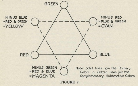 Source: Ball, J. Arthur (1935): The Technicolor Process of Three Color Cinematography. In: Academy Technicians Branch Technical Bulletin, May 31, 1953, 1935 Volume, p. 5.
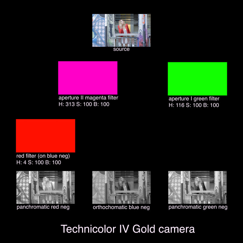
THE CAMERA
Let’s start building this thing, using what we did for Technicolor No. III in After Effects.
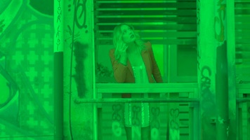
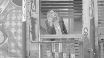
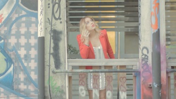
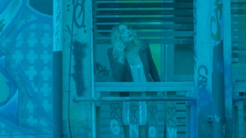
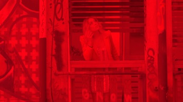
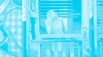
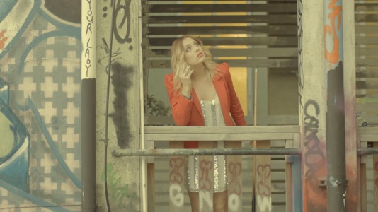
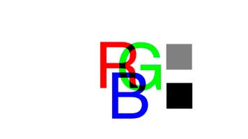
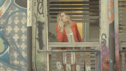
This will be our Source comp image, simulating the light through the lens.
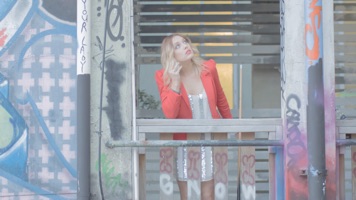 Source. Welcome back, Casey.
Like the 2-separation Technicolor camera from No. II and III, the Technicolor No. IV camera used a single prism or beamsplitter to separate the incoming light to two locations, Aperture I and Aperture II, and then used a very clever filtering process to make the 2 apertures expose 3 color separations.
Going back to Arthur J. Ball’s Figure 1, let’s colour it in to see more clearly what is going on.
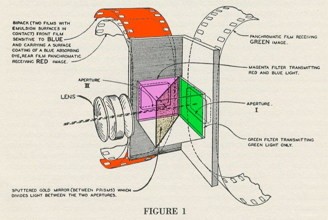
According to the document, incoming light through Aperture I was filtered green and light through Aperture II was filtered magenta. Behind each aperture was negative film. Aperture I captured the green image on to panchromatic (full spectrum) film.
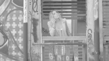
So far it sounds just like how Technicolor No. II worked, a filter (in After Effects: a colour solid, multiply blending mode, and a B&W effect). Let’s build Aperture I.
Aperture I
Start a new comp, call it Aperture I, or Green Neg if you want, because that’s what we’re going to end up with. Put in our source, add a color solid that fills the frame, and color it green.
The detective story starts here. In all my poking around these last three years of trying to make this thing work, I’ve never seen an example of the green filter, or the magenta filter. So I have no precise idea of what the green in the green filter means in terms of hue, saturation or brightness.
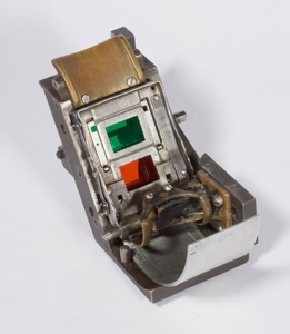 Technicolor System 2 Camera beam splitter, from The Eastman Museum.
But we do have the Technicolor No. III camera’s filters, and I’m willing to bet that the filters were exactly the same or slightly improved, because that’s how engineers work. They iterate, building off what was there before and improving on it.
So, assuming that I’m right, let’s set the green solid to the same as the improved-on sample from the Technicolor II process: Hue 116, Saturation 64%, Brightness 100%.
 Aperture I, green filtered using the Technicolor III filter.
Then add an adjustment layer, name it Panchromatic and put in the Black & White effect, setting all the colour channels to 100 to get the full range of blacks to whites.
 Green neg.
Aperture II
Let’s build Aperture II. Aperture II’s light was reflected off a metallic gold sputtered half silvered mirror. If you take a look at the image of the beamsplitter, you can see how the gold mirror affected the colour, warming it to a golden hue, while the light that passed through to Aperture I was unaffected.
In an After Effects comp named Aperture II, we’ll add in the source, and add a colour solid to simulate the gold mirror, set to Hue 52, Sat 40, Brightness 100 (sampled from the image on the left), on a multiply blending mode and set to 40% opacity (the reflectivity of a beamsplitter mirror).
 Golden.
According to Figure 1, the light then passes through a magenta filter.
I don’t have a sample of the magenta filter, so I’m going to make a guess on what colour values it had. Based on Figure 2, we’re looking to filter for red and blue, for the magenta print matrix.
So, I’m going to use a magenta filter with the colour values from the only magenta source I have: the magenta print matrix.
Based on samples from a print and pushing brightness to 100% as we did in Technicolor II, I get: Hue: 303, Saturation: 90% and Brightness 100%.
Adding in a multiplied color solid gets us here.
 Aperture II. No green allowed.
Blue Separation
From this image we’re going to make the blue and red colour separations. The blue separation used orthochromatic film stock that was only sensitive to blue and green. Why use orthochromatic for blue? Because the people at Technicolor were geniuses! They were running out of space in the already huge technicolor camera, so they used a film that couldn’t see red, fed it a magenta image (blue and red only) and eliminated the need for a blue filter.
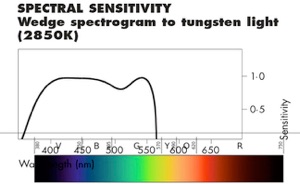
Getting a good digital orthochromatic simulation is tricky. Orthochromatic isn’t sensitive to reds or yellows, but how do we know where to do the cut offs, and is the cut off sharp or does it a roll off?
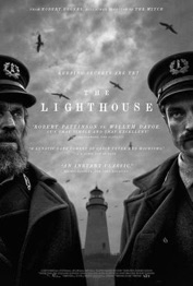
Stealing ideas from what Jarin Blaschke did on his tests for The Lighthouse, using two Tiffen filters he mentions were “very effective indeed” at getting Kodak Double-X pizza 222 film stock1 close to what orthochromatic film recorded: Tiffen 47 and 58 filters, I made two colour samples from Tiffen 47 and 58. Checking out the colour values, there was still some red in each, so I zeroed out the red in the solid settings, blended the results together with an add blending mode and built myself a custom orthochromatic filter based on the result: H: 194, S: 100%, B: 44%.
 The orthochromatic filter applied to the source (not the Aperture II) to illustrate what The Lighthouse’s ortho film sees from the full spectrum.
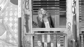
 And here’s Robert Pattison run though the ortho filter with the B&W effect on to get that just-stepped-out-of-the-coal-mine look.
Maybe that’s good, but we’re not looking for another filter simulation but a film stock simulation. To do better, we need to dive into orthochromatic spectral sensitivity.
The left shows the spectral sensitivity of Ilford Ortho Plus orthochromatic copy film, with a really rough overlay of what the wavelength translates into what colour on the spectrum. Clearly, yellow and red have no sensitivity and the roll off is sharp.
While there is a dip in sensitivity for cyan, we don’t need to put that into our model. That same dip occurs with Ilford Delta 400, which means that it’s a normal response of film to light, and would be already taken care of by digital sensors which are tuned to mimic film’s response to light.
To make orthochromatic in our digital model, the answer is simple: just use the B&W effect again, set Red and Yellow to 0, and everything else to 100.
 Testing it B&W with red and yellow at 0 on Robert P. Looks like the logic holds up. His skin matches the ortho filter and is closer to the skin tone on the poster for The Lighthouse.
So for the Blue Negative, take the Aperture II comp in a new comp and name it Blue Negative. Then add in the adjustment layer as before, with a Black & White effect set to 100 all the way, except for Red and Yellow, set to 0.
 The blue negative.
Red Separation
Bi-packed behind the blue negative was a panchromatic film stock, sensitive to full spectrum, but filtered by the blue negative strip that was prepared for the camera by dying it red to act as a filter. You can see it clearly on the Technicolor 3-strip camera on display at the Eastman Museum.
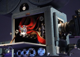 Technicolor IV camera from the Museum of the Moving Image. Source: Helena’s Blog.
Again, it’s a total genius design to save adding filters, or using a three way prism in an already bulky camera (weighing some 400 lbs with the sound baffling blimp added).
And thanks to the image above, we have a colour to take values from. Leveled out, I get: H: 4, S:83%, B: 71%, which is a bit different in hue but almost the same saturation as the Technicolor III filter of H: 19, S: 84%, B: 100%.
For the red separation, build a new comp and drop in the Aperture II comp. Add a multiplied color solid red filter with H: 4, S: 83%, B: 100% (maxed out Brightness as before).
 Magenta plus red takes out the blue.
Then make it a panchromatic black and white with an adjustment layer with the Black & White filter at 100.
 The red negative. (I know it’s a positive.)
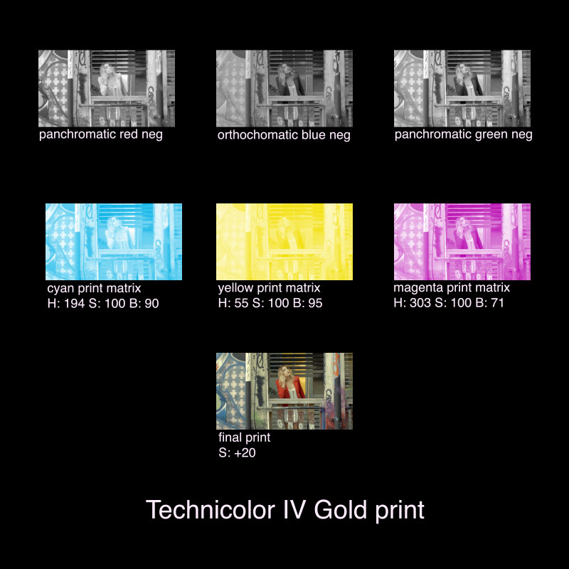
THE PRINT
Next we build the print. The colour separations were printed onto three separate prints, chemically stripped of their silver nitrates and infused with complimentary a dyes, and then pressed, in passes, on to a receiver film with a lightly exposed image from the green neg to hold the colour and prevent bleeding. Yes, pressed. Pretty amazing.2
For our digital model, the receiver doesn’t factor into the final image. It was used to hold the dye that was then pressed on to the print. For this model, we can ignore it, because colours don’t bleed in digital, and if we use it, it darkens the image if we multiplied in. But if you’re following along at home, use it if you want to. I’m not going to stop you. 3
In After Effects, make the matrix prints by creating new comps for each dye layer with each the corresponding negatives, and adding the dye with CC Toner set to Duotone, with pure white Highlights and yellow, cyan or magenta shadows. This takes the density of the blue neg and maps it onto our yellow dye, like the dye infusion process.
Dyes
Going back to Arthur Ball’s Figure 2, we can see what colour separation gets what dye. Red gets it’s Cyan, Green gets Magenta and Blue gets Yellow.
With thanks to Timeline of Historical Film Colors, we can take our dye colour samples from a sample Technicolor print with pure dyes.
 Crop from Bradford_TechnicolorIV_1990_5036_12593_JD_JK_IMG_0001.jpg from Timeline of Historical Film Colors.
After correcting the sample image to white and black levels, I get:
- Yellow - Hue: 55, Saturation: 83% Brightness: 95%
- Cyan - Hue: 194, Saturation: 55% Brightness: 90%
- Magenta - Hue: 303, Saturation: 100% Brightness: 71%
When we do a dye sample check with these values, we get this:
Not exactly a good black in there. So just like in Technicolor No. III, we’ll max out the saturation level to 100% on each dye to get a pure black.
Great. And it looks like the brightness differences that I sampled check out with what Giorgio Trumpy measured for Film Colors: Yellow brightest, Cyan a little less so, Magenta the least.
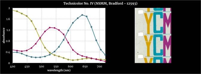 Absorbances measured with a multispectral imaging system from film areas with pure dyes. Credit: Giorgio Trumpy, ERC Advanced Grant FilmColors, from Timeline of Historical Film Colors.
Print Matrixes
Ok, with decent dye samples, let’s build a print. For the yellow matrix, take the blue negative,
add yellow dye with CC Toner, shadows set to Hue: 55, Saturation: 100% Brightness: 95%.
For the cyan matrix, take the red negative,
add cyan dye with CC Toner, shadows set to Hue: 194, Saturation: 100% Brightness: 90%.
For the magenta matrix, take the green negative,

add magenta dye with CC Toner, shadows set to Hue: 303, Saturation: 100% Brightness: 71%.
And for the final comp, let’s make a Technicolor IV print. Make a new comp and press in each colour matrix by layering each with a multiply blending mode.
Yellow,
plus Cyan,
plus Magenta.
Not too bad.
Compared to an actual print though, we can see a few things in this initial attempting at modeling Technicolor No. IV,
 Blood and Sand (USA 1941, Rouben Mamoulian). Dye-transfer nitrate print from 1941. Credit: Courtesy of BFI National Archive. Photographs by Barbara Flueckiger, from Timeline of Historical Film Colors.
- Looking at the dress in Blood and Sand and comparing it to the white post on the left of the Casey image, there’s too much yellow, probably from the faux gold mirror in Aperture II. While a pretty good guess, I suspect the YCM film sample that I took the dyes from already reflects the yellow bias, or maybe the gold mirror just doesn’t do what I thought it does (reflect golden biased light).
- I’m probably already getting pretty good colour separations, because I used the same 100% bright filtering system I used in Technicolor III, but I wonder about that green filter. It was at 64% saturation and it had a lot of red leaking through.
- There’s no punch to the image. Those are deep reds on the chess pieces and deep blues on the tiles. Doing a saturation pass to simulate the dye transfer quality, like I did in Technicolor III might help.
FUN
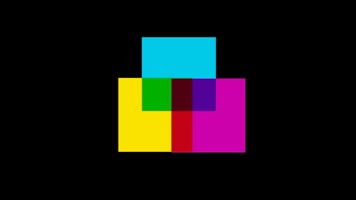
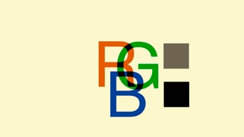
Let’s put some solid colours through the model to see what’s going on. Putting this source image:
through the model, we get this:
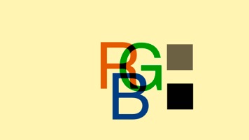
This image confirms a few things. Whites are too golden, reds are not fully saturated (a bit transparent), greens more saturated than red and less than blues which seem to be doing ok.
Mirror
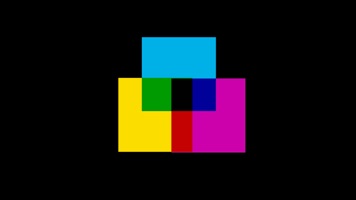
Starting with the gold mirror issue, taking the mirror out of the model (Aperture II) gives this as a final result:
That slightly-yellow white looks like a better match to the highlights of Rita Hayworth’s yellow-biased dress from Blood and Sand. So maybe the gold mirror wasn't as big a factor as I supposed, or the gold mirror is already factored into the result of the model by the dye samples I used (which have already been run through a Technicolor IV camera's gold mirror.)
Filters
For the filters used for creating the colour separations, let’s take a look at the one with the best saturation, the blue separation.
White comes through as a white, and blue gets filtered out without effecting red or green.
This is being passed through one filter, the Magenta in Aperture II and the Orthochromatic film in the blue negative. I set the filter at Magenta: H: 313, S: 90%, B 100%,
and the Orthrochromatic film at, Orthochromatic: B&W effect set to 100, except for Red and Yellow at 0.
The least effective separation is the green,
Whites stay white, green gets filtered out, but Red and Blue also get a bit filtered out. The green filter is set at, H: 116, S: 64%, B: 100%.
And the red separation gets this,
with settings of, H: 4, S 83%, B: 100%.
From this we can see that full filter saturation is key to getting a full colour separation, and that 100% brightness is key to getting an unaffected white.
So, lets bump up the saturation on the green filter. The green filter’s 64% saturation was needed in Technicolor No. III; it was needed to collect a little bit of the blue to shift it over to the red dye, otherwise blue would just show up as black. But for Technicolor No. IV, we need a only-green separation.
If we take the about 85% saturation level from red and apply the same saturation to the green saturation, we get this,
Better red and green saturation, R at 99%, G at 96% and at 81%.
So, what the heck, let’s just set everything to 100% saturation in all the filters including the Magenta in Aperture II,
and I read 99% saturation in the R G and B.
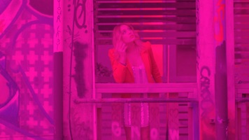
Now, applying all these adjustments to our sample and comparing it to Blood and Sand,
We’re closer, but still not there yet. The thing is, it’s not a fair fight. The image of Casey in the red jacket is fairly low contrast, so if we use a brightness and contrast effect adjustment on the source image,
and feed the more contrasty image through the Technicolor No. IV model we get,

And for fun, if we do a saturation pass on the final comp (using +20 saturation from the levels effect), the same as we did in Technicolor No. III, we get,
Now, that’s looking more like it. Yellow tinted whites, deep blacks and rich colour saturation, and that same set of red, green and blue tones.
PROCESS
Here’s the overview of the process, using the more contrasty source, and the better filtering.
Notes
-
Sorry, in-joke from my film school days. Pizza 222 was the student pizza of choice at SFU film, and also the only black and white film stock we had available to us, Kodak 7222.↩
-
For more on Technicolor No. IV, see Timeline of Historical Film Colors.↩
-
Also check out Fabulous Technicolor! - A History of Low Fade Color Print Stocks.↩
Published Friday, December 4, 2020.