Cinecolor 1932-1950
Cinecolor was the successor to Multicolor, a 2-colour process that printed using red and blue dyes, with a “brilliance” of yellow added in as a highlight tanning. From what I’ve seen from playing with it, Cinecolor can produce some absolutely beautiful images with combinations of deep blues, orangey-red reds and golden skin tones. The use of red, blue and yellow toning was a brilliant choice by Multicolor and even more refined by Cinecolor. No wonder the 2-colour process lasted through the 1940’s as a competitor to Technicolor’s 3-colour system.1 It was the cheaper choice, easier to shoot and defined a blue-orange look that was rediscovered in the early 2000’s by the control offered by the Digital Intermediate process.
Cinecolor should be pretty straightforward to model, since it’s the same process as Multicolor, but with slightly different (and improved) dye colours. So let’s get into it. If you haven’t seen my other digital processes, please take a look at an explanation of how I do it to follow along.
The Camera

Cinecolor uses the same bipack camera as Multicolor, so there’s no need to re-explain how to model it. Please refer to the Multicolor article on how to do it.
Here’s an outline of the camera part of the process:

The Print
Cinecolor used the same duplitized stock (that could be exposed with different images on both sides, making a layered image) and each emulsion side was toned, with red on one side and blue on the other. Once toned, the red side served as a mordant for a yellow brilliance toning, which means that the red toning of the darks of the positive print held the yellow colouring of the tanning, leaving the highlights alone.
I’ll do the same as the Multicolor digital print process, but with different dye values, sampled from a Cinecolor print.
Let’s start with this image, which seems a good candidate as any for getting dye samples. It has a good blue, red spilling from the sides of the frame and the yellow tanning on the emulsion between the frames.

It’s interesting to see how the prints changed from Multicolor. In 1944, films could have embedded soundtracks so that was added to the side on the blue emulsion side. The the toning dyes also appear to have been applied slightly differently (sharper edges, matte boxes, even density – all probably due to needing precision for a good sound track), which would have required different machinery. Perhaps this also reflects Cinecolor’s improved ability to generate prints to match the release demands for large theatre releases.
I get these colour values from sampling the image:
- Blue Hue: 213 Saturation: 87% Brightness: 76%,
- Red Hue: 24 Saturation: 92% Brightness: 85%,
- Brilliance (yellow) Hue: 58 Saturation: 13% Brightness: 99%.
Adjusting for saturation and brightness (putting both at 100% for the dyes) and running that through the model, gives this:

It’s close. Overall the cast is a little too green. There’s somewhat of a decent black, with a green cast as per the original, and a white white. But if we concentrate on the grey patch, we can probably do some things to adjust it to more neutral.
The aim is to get rid of the green cast, so starting with the blue dye, let’s take some of the blue out of it. To do this, I like to work in 8-bit 0 to 255 values, which makes things a bit easier on my brain.
In 8-bit RGB, blue is currently set to R: 0 G: 115 B: 255. 255 on blue is the max value, which is good. The digital dye is giving us all the blue it can, but let’s reduce the amount of green slightly. I reduced it down to 0 72 255.
With the less green blue dye, the grey patch reads more balanced with red and green, but blue is still too much. I don’t want to reduce blue with the blue dye because I want full saturation on blue for good blacks, so let’s add in some yellow brilliance which will mix in some opposing colour in the midtones. The yellow is mapped in using the blue/green separation, the same one that maps in the red dye, so there is more yellow layered in with a different mapping from the blue dye.
All we need to do is just increase the density of the yellow, which means upping the saturation on the yellow brilliance. I went from 13% to 30% and it looks like the grey patch is pretty much neutral now.

As a bonus the skin tones came out alright too.
That’s pretty much it, but what I’m not going into is the huge amount of time and futzing this took me to get to this point. There was a lot of pushing and pulling of colour values and wrong ideas, late nights thinking I finally had it, and then going back to basics along the way.
The real trick of doing these things is getting a decent sample, and then working the variables one at a time to understand how it works and produce something that mimics what must have been a long drawn out process in photochemical.
Wait a minute, Cinecolor is a two color process!
Yes, Cinecolor is billed as two color process, but like almost any of the early "two colour" processes, there is third colour added somewhere in the printing process to somewhat completed the colour wheel. It would probably be better to call these early colour processes two colour capture, because that's what they mainly do, capture two negatives using some kind of colour separation process (filtering and/or limited spectrum sensitive film).
How does Cinecolor add in yellow? To quote Roderick T. Ryan, from A History of Motion Picture Color Technology,2
The steps in the Cinecolor two-color process were as follows:
- Black and white development. The two picture records and the sound track were developed to a black and white silver image.
- Wash and squeegee.
- Blue-green toning. The print was floated on the surface of the cyan toning bath with the image from the red record and the sound track facing down.
- Wash.
- Fix.
- Pre-dip.
- Mordanting. The film was immersed in a mordanting solution which converted the silver image from the blue-green record to a silver iodide which has the property of absorbing basic dyes. The side containing the cyan ferric ferrocyanide image was not affected by this treatment.
- Clearing bath. Clear in a 2% solution of sodium bisulfite.
- Wash and squeegee.
- Red-orange toning. The print was immersed in a orange-red dye solution.
- Final wash and drying.
The boldface is mine. No where in there does it specifically mention adding yellow "brilliance" like with Multicolor, or mention yellow dying at all. But a little further on in Roderick T. Ryan's article, he describes what Mordanting means by giving the recipe for an Iodine Mordant.
For any kid raised in the 70's in North America (or anyone who's worked in an Operating Room), you know what colour iodine is, because our mom's slathered iodine all over any road rash wounds from crashing our bikes. It's orange, and it dries yellow stains all over your skin, similar to how it would leave yellow all over a film emulsion.
Particularly, Cinecolor used a pretty standard process of using silver iodide, first used back in the early 1900's for mordant toning to prepare the silver image in an emulsion for colouring.3 Silver iodide is supposed to be nearly colourless, but it's that nearly part that is interesting. There is definitely some yellow in the unexposed parts of the prints (in film terms, less dense; in digital terms, the highlights). Take a look at the print sample from Mystic India, and tell me there isn't yellow on the right side of the frame and "nearly colourless" yellow in the emulsion between the sprocket holes.
Also take a look at this other image as well,

There is yellow all over the film base on the right edge between the sprocket holes and on the left in the NITRATE FILM edge marks.
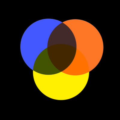
Without the yellow, you don't get the greens. And there's a ton of green in that Movietone Adventures title, as well as a ton of yellow. Neither green (or yellow) can be generated by mixing just red-orange and blue.
Maybe is was just a happy mistake of the requirements of the chemical process, but yellow was essential to making Cinecolor work.
Differences from original
What’s missing from this digital model is the depth of the print. Because the prints were two-sided, one colour was always softer than the other when screened, because the projector could only be focused sharp on one side of the print.4 We're also missing a bit of grain, worn prints, colour bleeding, scratches, a registration errors. I mean, whadda want from me, I work in digital!
Print workflows
Here’s the print process:

Luts
I’ll make LUTs available on the projects page.
Published Friday, February 24, 2023.
Updated Monday, May 22, 2023.
Notes
- See The Widescreen Museum for more on Cinecolor.↩
- Ryan, Roderick T. (1977): A History of Motion Picture Color Technology. London: Focal Press, pp. 102-106. from filmcolors.org↩
- Mordant toning, from 1909, is described on filmcolors.org.↩
- See Anonymous (1947): Trucolor Only Acetate Releases ’til 1948. Splicing and Focusing Data. In: International Projectionist, 22,8, p. 12 and pp. 35–36.↩